A space center has an unusual branding problem. The past is spectacular. It contains moon landings, extraordinary machines and the kind of achievement that can make the future sound like a disappointing sequel. In October 2022, Space Center Houston announced a different ambition: a campus where visitors could watch the next era of exploration take shape. The proposed facilities included simulated lunar and Martian terrain. Its identity needed to make room for what came next.
That assignment went to Traina, an independent branding agency in San Diego. The center’s communications director, Erik Blanchard, later put the engagement at about $350,000. Before the redesign came a four-week audit: interviews, surveys and a reading of the organization’s historical strategy documents. There is something pleasingly earthbound about that sequence. To help a space institution describe its future, the designers began with homework.

The trouble with being familiar
Traina’s portfolio rewards a particular kind of reading. Look past the individual logos and a recurring problem appears: an organization’s capabilities have moved faster than its reputation. Familiarity, usually a marketing asset, becomes a constraint. People know the name so well that they stop asking what it might mean now.
For Space Center Houston, Traina describes that constraint as the perception of a museum devoted to the past. Its work extended across positioning, language, visual identity, environmental graphics and the website. The center’s public brand guide shows the machinery underneath: a mark called the Nova, a geometric grid, reusable shapes and rules for photographs. The pieces can travel together without requiring every application to look identical.
“The way they articulated the business case behind their recommendations was high-level.”
Erik Blanchard · Space Center Houston
That distinction matters. A recognizable logo can identify who is speaking. A coordinated system also helps explain what the organization wants to say. At a space center, the sign, the ticket-buying journey and the images of visitors should make compatible promises.
Reported following the brand launch. These changes describe performance over time; they do not isolate the rebrand’s contribution.
The grocery aisle is part of the brief
Stater Bros. presents a less cosmic version of the same problem. The Southern California grocer had a long association with affordability. Walmart and Target made that territory harder to own. Traina’s research pointed toward community and family, with particular attention to the Hispanic communities the stores already served.
The resulting work reached into bilingual communication, merchandising and in-store music. The curve of the existing “S” became a recurring visual element. The “Bring It Home” campaign connected food with family occasions. For an internal rollout covering 172 stores and 18,000 employees, Traina developed guides, training and a curriculum. Those figures describe the rollout at the time, rather than today’s chain size.
The interesting detail is the music. It exposes how limited a purely visual definition of branding can be. If a store says it understands its neighbors, people can assess that claim while pushing a cart. The promise has to make sense in the aisle, where nobody has read the strategy presentation.
- 01Find the old assumptionWhat does the audience think it knows?
- 02Choose the new meaningWhat can the business credibly demonstrate?
- 03Put it where people lookGive the website, campaign and staff usable tools.
Sometimes the customer is a candidate
John Deere wanted technologists to consider careers beyond the familiar Silicon Valley employers. Traina’s Tech@Deere work gathered stakeholders from Deere’s Intelligent Solutions Group, Blue River Technologies and Bear Flag Robotics. Their common material included autonomous machinery, computer vision and the appeal of making something that works in the physical world.
A recruitment microsite translated that into a way to explore the technology businesses. The project supported the opening of Deere’s Austin technology hub during SXSW 2022. Here, the person being persuaded was a potential colleague. The brand’s job was to help that person imagine a working life.
That is a useful clue to Traina’s place in the market. It works with organizations trying to explain consequential change: a new audience, a new business or a new reason to pay attention. Its services connect brand consulting to design and implementation. Buyers can engage it for research and identity work, then extend that work into campaigns and digital experiences.
Three businesses. Two months. One name.
Velsera compressed the problem into a deadline. Three healthcare and biopharma businesses were coming together, with a debut at the J.P. Morgan Healthcare Conference two months away. Traina worked on the name, positioning, identity, launch microsite and video while the business itself was still taking shape.
The name is an anagram of “reveals,” a small puzzle hidden in plain sight. The strategy used an engine as an analogy for moving information between research and healthcare. This was a brief with several audiences: employees needed a shared identity, existing customers needed continuity, and the market needed a reason to care.
For a buyer, that breadth is both useful and demanding. Combining strategy, writing and design can reduce the translation required between suppliers. It also requires access to people who can make decisions. A team that wants only a quick decorative update may find a research-led engagement too involved. That is a judgment about fit, rather than a criticism of the work.
The agency had to redraw itself, too
David Traina’s own beginnings were less orderly than a strategy diagram. In an earlier founder interview, he recalled moving to San Diego in 2005 with his family and staying with his in-laws. After taking a local design job, he received a call from a Microsoft contact offering creative work. Microsoft became the agency’s early anchor. Traina’s official history dates its client partnerships from 2006.

Then the operating assumptions changed. In a July 2025 interview, the founder described reducing a team of more than 30 to a core of 12, using contractors for production, development and video, and leaving the longstanding Scripps Ranch office. He linked the rethink to economic uncertainty after Covid, remote-work challenges, new competitors and AI. His response was to make the organization smaller and more flexible.
The agency’s published culture page puts some concrete terms around working there: profit-sharing, a retirement-plan match, parental leave and summer Fridays ending at two. It describes a team spread across the country. The business model remains client-funded creative services, including continuing relationships as an extension of a marketing team. The organizational question is how much of that work should live permanently inside the agency.
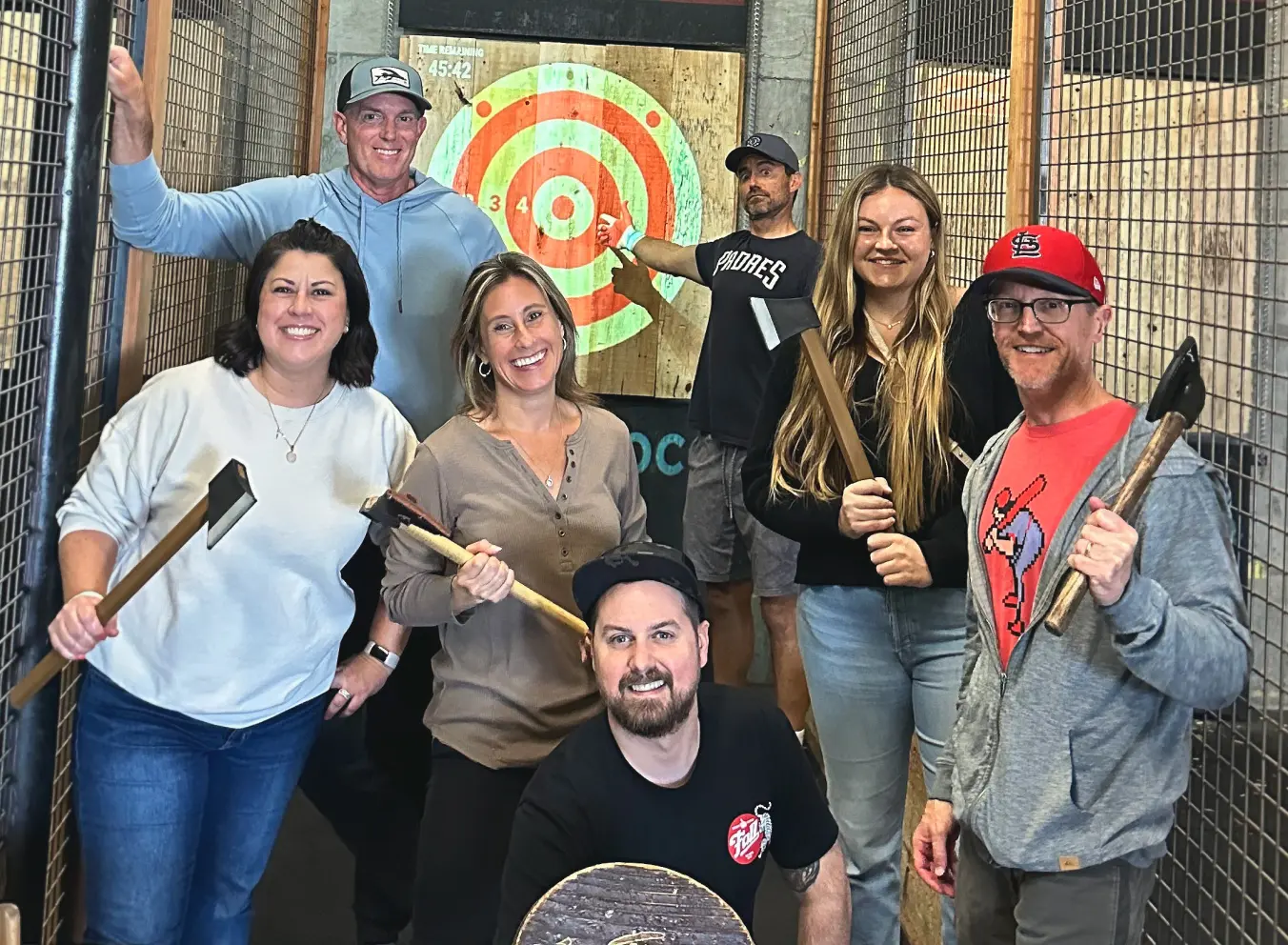
Before you commission the new look
The cost of the Houston engagement is a useful point of reference precisely because it came with a defined scope and period: December 2021 to December 2022. It is historical client-reported spending, not a menu price. A buyer should ask what research, revisions, implementation and continuing support the proposed fee includes.
The practical lesson to borrow from these projects is to write the misunderstanding into the brief. “People think we only do X” is a better starting point than “we need to look fresh.” Follow it with evidence of what has changed. Then choose the encounter where that evidence matters: a recruiting page, a store visit, a conference introduction.
This approach asks something of the client. The new promise needs an operational basis, and employees need the means to deliver it. The Houston campus vision, the grocer’s community focus and Deere’s technology work gave the designers material to use. Without that substance, the new language would have little to explain.
Traina’s recent portfolio includes Western Digital, where imagery inspired by hard-drive glass platters supports a story about AI infrastructure. The object is familiar; its place in the conversation is changing. That is the agency’s recurring assignment, and the useful question its work leaves behind: what has your organization already become that your audience has yet to notice?
Follow the work
Watch the Space Center Houston brand film ↗
Listen: David Traina on The Basics of Branding ↗