An app can be ready to ship and still have a long shopping list. Screenshots for its store listing. A preview video. An announcement inside the product. An email. Then the same idea in another language, with a headline that suddenly refuses to fit. Snack Bar Design makes a business out of that list. Its work occupies the busy space between a software team finishing a feature and a customer understanding why it deserves attention.
The studio’s portfolio is a tour of familiar software names seen from an unfamiliar angle: Lightroom screenshot layouts, Acrobat Reader event creative, Adobe Express messages, and an Oculus visual system. These are individual pieces of a brand’s public presence. The interesting question is how a small outside team can keep producing them coherently as the requests multiply.
The launch has more than one front door
Snack Bar’s published work stretches from app stores to inboxes. Adobe Illustrator appears through an email and landing-page project; eharmony through email images and animation; Recorded Future through PDFs and ebooks. The variety matters because the company is selling visual production to teams with several places to reach their audience. An enterprise buyer may need a document as urgently as a mobile marketer needs a screenshot.
That puts the studio in a specific part of the design market. Its customer already has something to explain, promote, or update. Snack Bar supplies the visual material around that product, with services extending into tutorials, paywalls, social assets, and display advertising. For a prospective client, the portfolio is more useful as a menu of working formats than as a parade of logos. It shows the kinds of assignments the studio takes on.
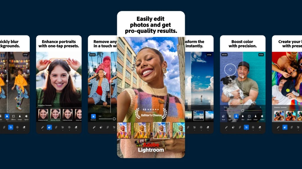
A useful way to read that menu is by the question each asset must answer. A store image introduces a benefit. An in-app message brings attention to something available now. An email gives someone a reason to return. The work has a common visual vocabulary, but the audience arrives with different knowledge at each stop. Repeating the same composition everywhere would waste those differences.
A screenshot is a tiny demonstration
App stores give this work unusually tight boundaries. Apple permits up to ten screenshots and up to three preview videos on a product page. Previews can run for up to 30 seconds and autoplay with sound muted. Depending on screenshot orientation, the first one to three images can appear in search results when a preview is absent. The order of the pictures therefore affects what someone encounters before opening the full listing.
Those rules make editing a commercial skill. There is limited room to establish what an app does, and a video cannot assume the viewer hears its narration. A polished asset still needs a legible idea. For the person commissioning the work, “make it beautiful” is an incomplete brief. “Make this particular benefit understandable without audio” gives a designer something more useful to solve.
In its essay on screenshot design, Snack Bar argues for recognizable scenes in photo-editing apps: images that help viewers imagine making something themselves. It also describes working with ASO partners to test messaging and image order. ASO means app store optimization. The studio’s account treats creative approval as one stage in a cycle that continues with feedback and revision.
“Scale on-brand design without adding headcount.”
Snack Bar’s public pitch
The practical lesson is to choose an observable question before producing the next batch. Would a different opening image explain the benefit faster? Would showing the finished photograph make more sense than showing a control panel? Apple’s product-page optimization tools allow tests of icons, screenshots, and previews. A team can compare alternatives instead of treating the most persuasive person in the review meeting as the final judge.
The file count nobody puts in the pitch
Localization adds another production problem. Snack Bar explicitly includes cultural adaptation, awareness of right-to-left reading, and space for text that might otherwise be cut off. Those details sound modest until a campaign has to accommodate them. A headline belongs to a layout; changing its language can change its length, emphasis, and relationship to the image. Translation creates a design assignment of its own.
Consider an illustrative brief: four visual concepts, three markets, and two formats. That is 24 possible combinations before a second revision. This is arithmetic, not a claim about Snack Bar’s output. It explains why a seemingly small request can fill a production calendar. Every additional choice creates more files to name, inspect, approve, and deliver.
before revisions
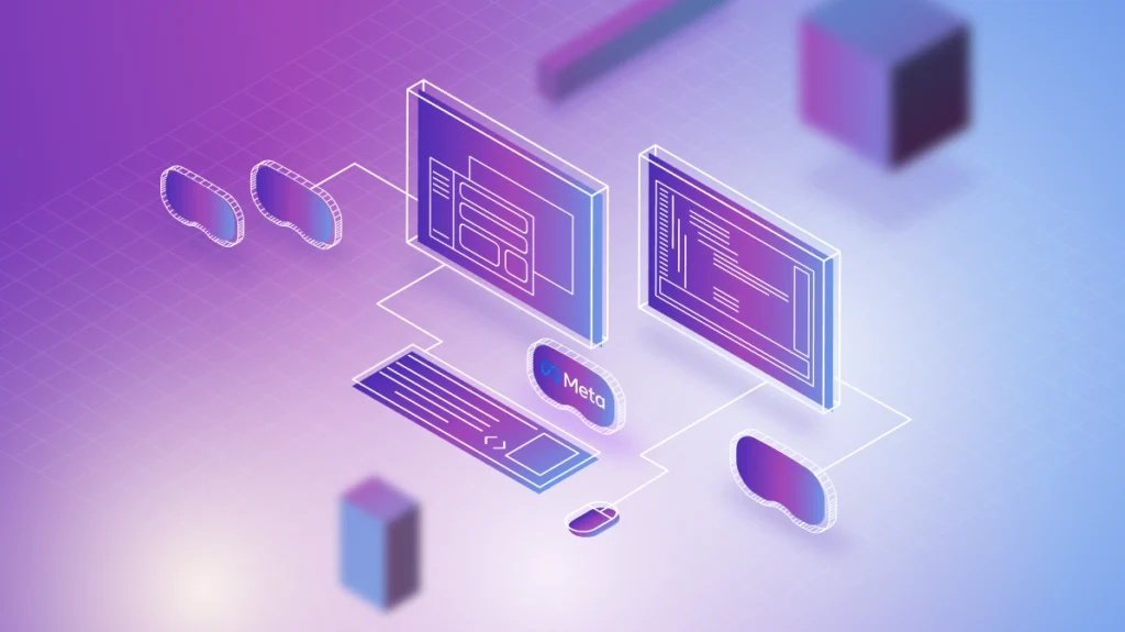
A reusable visual system can make that workload easier to manage. It establishes decisions that should persist while leaving room for the parts that must change. Snack Bar’s portfolio includes a Meta Oculus visual design system, an assignment consistent with this broader production role. For a buyer, a useful test of such a system is whether another designer can make the next asset without guessing at the rules.
Buying a place in the workflow
The studio’s collaboration pitch is direct access to the designers, working within a client’s existing tools and process. That is a concrete distinction a buyer can evaluate against a larger agency, a freelance arrangement, or hiring internally. The relevant comparison is how much coordination each option requires, how well it understands the brand, and how reliably it can absorb the next request.
Its recurring service model fits work that returns. A retainer gives the relationship continuity; the business case depends on having enough useful assignments to sustain it. A product team with regular releases and several markets has a different requirement from a company commissioning one isolated illustration. The same supplier arrangement need not be economical for both.
Cost should be assessed at the level of the brief. Count the concepts, formats, languages, approval rounds, and final deliverables. Establish who provides the copy and who signs off local versions. These are suggested buying questions, not claims about Snack Bar’s contract terms. They make an agency proposal easier to compare with the time and management effort an internal team would spend on the same job.
A public contract designer vacancy offers a narrower financial detail: $50-$70 an hour in compensation. That figure describes pay for the advertised role. Client fees cover a different scope of responsibility. Treating the vacancy as a price list would confuse the cost of one contributor with the price of a delivered service.
Remote contract role. A labor-rate reference, not a customer quote.
The listing asks for at least three years of digital design experience, Figma and Adobe skills, and independent working ability. Motion and app store experience are useful additions. It describes remote work with a Pacific-time preference. That combination suggests a working environment built around hands-on execution and communication, where a portfolio has to demonstrate the ability to finish real assignments.
A founder makes room for a different job
Michael Dolan’s personal site identifies him as Snack Bar’s founder and former creative director, with earlier visual design and art direction roles at Adobe. He dates the studio’s acquisition to 2025. The background helps explain the proximity to software marketing: his résumé includes experience inside the kind of organization that later appears in the agency’s portfolio.
Acquisition adviser Merge identifies Brain Power as the buyer and classifies the full sale in its under-$5-million bracket. Its account describes recurring retainers and established client relationships. It also describes the founder balancing increasing demand with a growing family and wanting time for other creative work. The priority became finding an owner who could take over operations while preserving continuity.
The ownership change raises a useful distinction for other founders. Making design and running a design company occupy different parts of the week. A business built around recurring work can have value to a successor, even when its founder wants a different daily routine. That is an interpretation of this transition, rather than evidence of a failed project or a rescue.
What to put in the next brief
For a team considering Snack Bar, start with an inventory of the work that keeps getting delayed. Separate the formats, identify the audience for each, and name the person who can approve them. Then choose one product benefit and ask for a small set of usable variations. This approach gives both sides something concrete to discuss before committing to an ongoing production relationship.
The conditions matter. An outside studio still needs accurate product information, accessible brand assets, and timely decisions from the client. If the offer is confusing or approvals remain unresolved, more production capacity may simply produce more waiting files. A team looking for sustained visual support should be ready to participate in the work, especially when results from tests are meant to inform the next version.
Snack Bar’s appeal lies in the specificity of its assignments. There is a screenshot to clarify, a message to fit, a sequence to animate, a local version to check. For product teams, those jobs are how a launch becomes visible. The next release will have its own list.
Inside the work
Explore the studio, its services and portfolio. Follow LinkedIn or Instagram, read the design blog, or discuss a brief.
Further reading: the acquisition account, Apple’s product-page guidance, and creative testing on the App Store.