A pizza chain can outgrow its font. Dodo Pizza liked the rounded letters it was using, but its own account describes a familiar expansion problem: too few styles, too few characters, imperfect Cyrillic and a licensing bill expected to climb with the business. The alphabet that had helped establish a recognizable brand was becoming an awkward traveling companion.
Paratype’s answer was Dodo Rounded, a custom family with adjustable weight and uppercase width. That is a more revealing introduction to the company than a wall of attractive specimens. The foundry works where a designer’s taste meets an organization’s practical demands: another country, another screen, another language that the original brief forgot.
Its products include fonts for books, websites, packaging and interfaces. Its customers include the people who design those things and the companies commissioning a visual identity of their own. The central proposition is straightforward: letters should carry a brand’s character without making the reader work for it.
A business built between alphabets
Paratype became independent in 1998, but its experience and library came out of ParaGraph’s earlier font operation. A contemporary report described the transfer of the font business to the new company. ParaGraph’s director said the department’s structure had started to constrain further development. This was a separation with an existing collection and business relationships, rather than a blank sheet of paper.
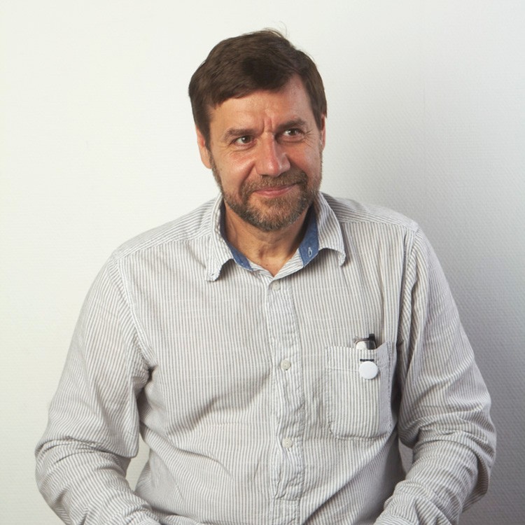
Co-founder Emil Yakupov, the first chief executive, had a background in computer modeling and software localization. Co-founder and art director Vladimir Yefimov brought the type-design expertise. Both became important figures in connecting Russian typography with the wider digital-font business. Adobe Fonts identifies the company’s headquarters as Saratoga, California; the creative history runs through Russia.
The international work predates independence. In 1992, ParaGraph reached an agreement to create Cyrillic companions for ITC typefaces. That work required more than finding roughly similar shapes. A typeface has proportions, rhythm and conventions. A second script has to belong to the same family while remaining comfortable for the people who actually read it.
This is still a useful way to locate Paratype in the market. A broad font marketplace offers choice. A custom foundry offers a particular design relationship. Paratype combines a store with original design, multilingual development and technical preparation. Its Cyrillic experience gives buyers a specific reason to look beyond an attractive Latin preview.
The alphabet checkbox is not enough
A font can contain a character without drawing it convincingly. Paratype’s public guide to Cyrillic explains differences in letter structure, width, spacing and stroke weight. It also distinguishes local traditions, including Bulgarian forms. For a company commissioning a multilingual identity, the implication is uncomfortable: a language-support list is the beginning of quality control.
The practical test is actual text, reviewed by people who know the language. A display alphabet may deliberately mix forms that would feel distracting in a paragraph. An italic can need different construction from an upright letter. A consistent visual voice does not require every script to behave like English.
Paratype also publishes a reference covering about 80 Cyrillic-based languages. That resource makes part of the expertise inspectable. A designer can investigate a brief before commissioning a font, and a buyer can ask a more useful question than whether the file includes Cyrillic. Which languages? Which forms? Which reading conditions?
The custom job has to earn its keep
Dodo’s published case makes the buying decision unusually legible. The existing family offered only light and bold, and the chain anticipated needing more licenses as it expanded. It wanted a broader alphabet and a familiar mood. A custom commission could address those requirements together. The case describes the motivation without publishing a project budget or a measured return.
Tilda, the website-building platform, supplies a different lesson. Its founder, Nikita Obukhov, says an initial attempt assumed the work could be outsourced and polished afterward. The next attempt brought closer participation and an adviser, Boril Karaivanov. Paratype’s credited collaborators include Dmitry Golub, Alexandra Korolkova and Nickolai Nedashkovsky.
“It took us two attempts to create the typeface.”
Nikita Obukhov, founder of Tilda
The result, Tilda Sans, combines seven weights in a variable family and is available free for commercial projects. The commissioning lesson is less glamorous than the finished specimen: a client needs to participate in deciding what a font must do. Outsourcing the drawing does not outsource the judgment.
For Sber, the brief grew into a system of 48 fonts, involving four designers and six technologists over almost two years. Presented in 2020, it separated text and display uses and included specialized interface and ATM work. Those numbers make the production effort tangible.
A useful inference from these commissions is that customization makes sense when requirements accumulate. Languages, recurring deployment and distinctive brand behavior can justify dedicated development. A small project already served by an existing family has a different calculation. The commissioning effort itself belongs in the budget.
The same calculation should include the handoff. Who will install the files, who will build the website, and who will inherit the design next year? A typeface can pass an art director’s review yet create avoidable work for the next team. Put those people into the brief early, alongside the list of languages and the intended applications. It gives the foundry concrete conditions to design against and gives the customer something more useful to approve than a handsome alphabet on a slide.
Some letters are allowed to misbehave
Paratype’s output is not all quiet competence. Grrr began with sketches for a custom job that the client considered too radical. Alexandra Korolkova and Dmitry Goloub developed the idea into a retail family, released in 2019. The name offers fair warning.
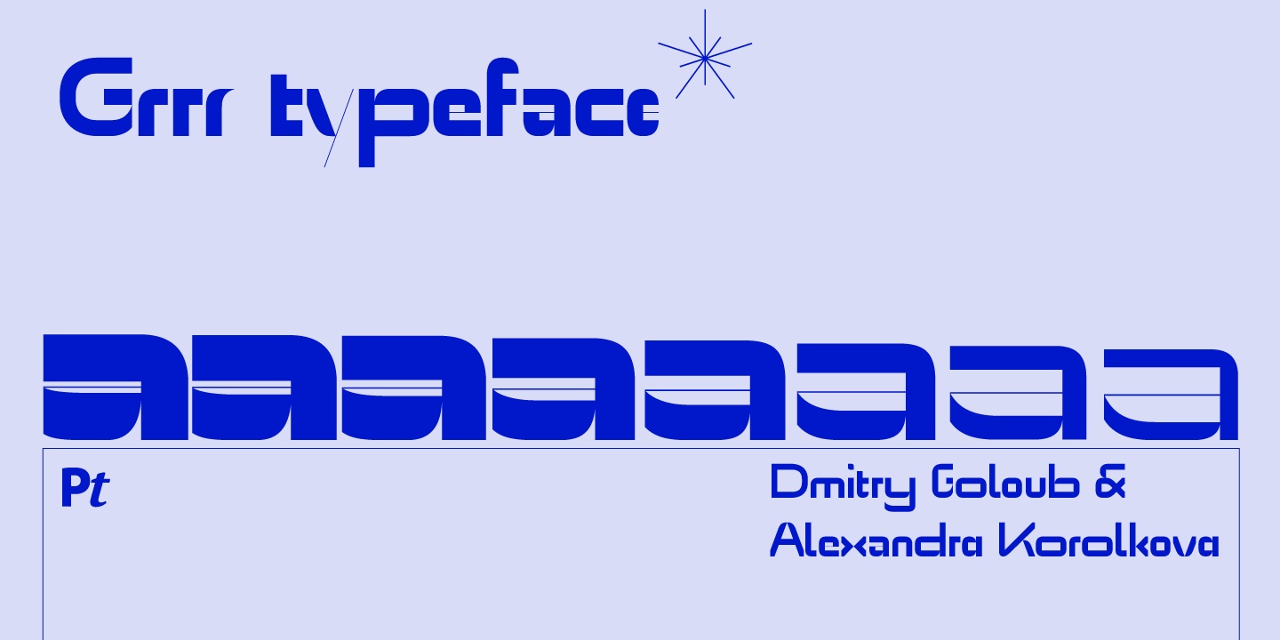
Its modular construction deliberately ignores some familiar optical adjustments. That gives the letters their blunt, mechanical personality. Paratype recommends starting around 21 points in print or 24 pixels on a non-Retina screen, with larger settings showing the design more fully. A poster can enjoy behavior a dense paragraph would struggle to accommodate.
The interesting decision was to change the destination of the work. Rejection by one client did not make the design useless; it made the fit wrong for that brief. For a creative business, that is a practical distinction, provided the work can legitimately become a product of its own.
A free font with a very particular trick
PT Root UI addresses a smaller, more everyday annoyance. Designed by Vitaly Kuzmin and released in 2018, it keeps each character’s width constant as the weight changes. Make a menu label bold and its letters do not demand more horizontal space. The original release supplied four styles and was a twentieth-anniversary gift from the company.
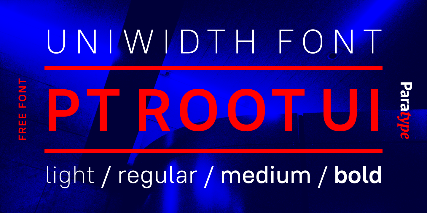
This property, called uniwidth, differs from making every letter equally wide. It is the same character across weights that retains its width. The distinction matters in interface states, where emphasis should not needlessly disturb a layout. It does not promise that a translated label will fit the same button.
The free-font strand goes back further. PT Sans appeared in 2009 for the Public Types project, with support extending to minority-language alphabets in Russia. PT Serif followed in 2010 as a companion. These releases gave designers usable families without a font purchase and put language access into the product itself.
Try the actual words before paying
Commercial licensing remains part of the business. At the time of research, MyFonts listed individual PT Root styles from US$39 and an 11-font family package at US$229. These are product-page examples in US dollars. The family, package and intended use determine the relevant purchase; a headline price is not a quote for every deployment.
Distribution also shapes the choice. Selected Paratype families appear through Adobe Fonts, while the foundry handles additional requirements such as custom modifications and organization-wide arrangements. Designers choosing among foundries should compare the required languages and uses along with the letterforms. The appropriate license belongs in that comparison.
Fontoscope lowers the cost of evaluating the design. Its gallery advertises more than 800 typefaces, and the desktop application makes trial fonts available inside creative software. Paratype’s guide describes use in applications including InDesign, Word and desktop Figma, with a separate Chrome extension for browser experiments.
The distinction to remember is between trying and deploying. The desktop trial fonts require Fontoscope to be running, and a finished project still needs the applicable license. Free evaluation is useful precisely because it lets the designer discover an unsuitable choice before committing to it.
Start with the least photogenic page in the project: the long product description, the crowded menu, the unfamiliar place name. Then test the beautiful headline. Paratype’s examples suggest that the value of a font becomes clearer when the words stop behaving like a specimen and start behaving like work.