Years after Emil Yakupov gave him two Paratype catalogues, Thomas Phinney was still using them. He would return to the pages to study how Cyrillic characters changed from one type style to another. In April 2014, he dedicated a release of Cyrillic encoding files to Yakupov’s memory. The gift had become part of another designer’s working equipment.
It is a pleasingly unceremonious way to influence a profession. A catalogue has prices, specimens, a practical reason to exist. Give it to the right person and it can also become a teacher. Yakupov understood the letters; he helped other people understand them, too.
His life crossed several worlds that do not always share a table: scientific research, software, type design and commerce. At Paratype, which he co-founded in 1998, the connections between them became the job. A typeface needed an artist, an engineer, a route to its users and someone prepared to make the whole arrangement work.
A researcher changes materials
Yakupov was born in Ufa on 22 March 1957. He graduated from the Moscow Institute of Management and began his career at the Research Institute for Synthetic Fibre in Tver, working on computer modelling of physical processes. His early professional material was considerably more literal than a font specimen’s paper.
In 1987, he completed a technical dissertation on determining the deformation characteristics of threads through an automated measurement system. There is a useful corrective here to the familiar story of a creative founder arriving fully formed. Yakupov’s working life began with measurement, materials and computation. Typography came later.
During perestroika, he began working independently on computing projects, including localisation of Norton Commander. Work with ParaGraph brought him into the type business. He eventually headed its type department, which became the separate company Paratype in 1998.
The change of field left room for his previous interests. Letterforms could be beautiful, historically specific and mathematically described. A curve had to look right, then survive the journey into software and onto a screen. There was plenty here for someone who enjoyed understanding how things behaved beneath their surfaces.
The letter meets the pixel
In 2003, Yakupov and Leonid Mestetskii published a paper on automatic font hinting. Its subject was one of the small technical negotiations behind readable type: how a letter’s outline becomes a pattern of pixels.
A drawn curve and a screen’s grid obey different rules. The curve can pass between the available squares; the display must make decisions about them. At small sizes, those decisions matter. The authors approached the problem through structural analysis, using a representation of a glyph’s skeleton and its relationship to the boundary.
A research problem Yakupov co-authored in 2003: preserve the letter’s structure as its representation changes.
The paper describes font production as a sequence of transformations between continuous and discrete images. That language belongs comfortably beside Yakupov’s earlier research. The thing being measured had changed. His interest in the passage between an object and a computational account of it remained useful.
It also helps explain why a type foundry needs more than a roomful of attractive drawings. The drawing is a beginning. Readers encounter what happens after the technical work has been done.
A place for the less familiar letters
The public-font project gave that work a direct cultural purpose. PT Sans and PT Serif were released in 2009 and 2010 with open licensing. Yakupov helped lead the project; Alexandra Korolkova and Olga Umpeleva did the design work under Vladimir Yefimov’s supervision. PT Mono joined the public-font family.
The ambition was to support the letters of minority languages using Cyrillic, alongside more familiar Latin and Cyrillic character sets. A language can possess an alphabet and a literature yet still encounter trouble when its speakers sit down at a computer. The required letter has to be available in the actual tools of daily writing.
This made access a design requirement. A font people could freely obtain and distribute had a different usefulness from one that existed only inside a particular office. Financial support from the Federal Agency for Press and Mass Communications helped make the project possible.
The need was visible to the people affected. In January 2010, Chuvash-language coverage welcomed PT Sans and described the workarounds people had been using: special fonts, mixtures of Cyrillic and Latin characters, or a switch of script. That is the human scale of a character set. An omission becomes someone else’s extra job.
“An alphabet is an ensemble.”
Emil Yakupov, November 2013 · translated from Russian
The useful detail in Yakupov’s description is the ensemble. A letter cannot merely look convincing in isolation. It needs to live beside other letters without appearing to have wandered in from a different party. The small mark that a casual reader overlooks may be essential to the person whose language requires it.
Eight styles with work to do
PT Sans offered eight styles, each with a practical assignment. Four supplied the familiar regular, bold, italic and bold italic choices. Two caption styles served smaller text. Two narrow styles helped fit words into limited space.
The caption designs were also intended for signs and information displays, where distance, angle and lighting complicate reading. The narrow designs addressed another everyday problem: a finite amount of paper and rather more language than the layout would ideally like.
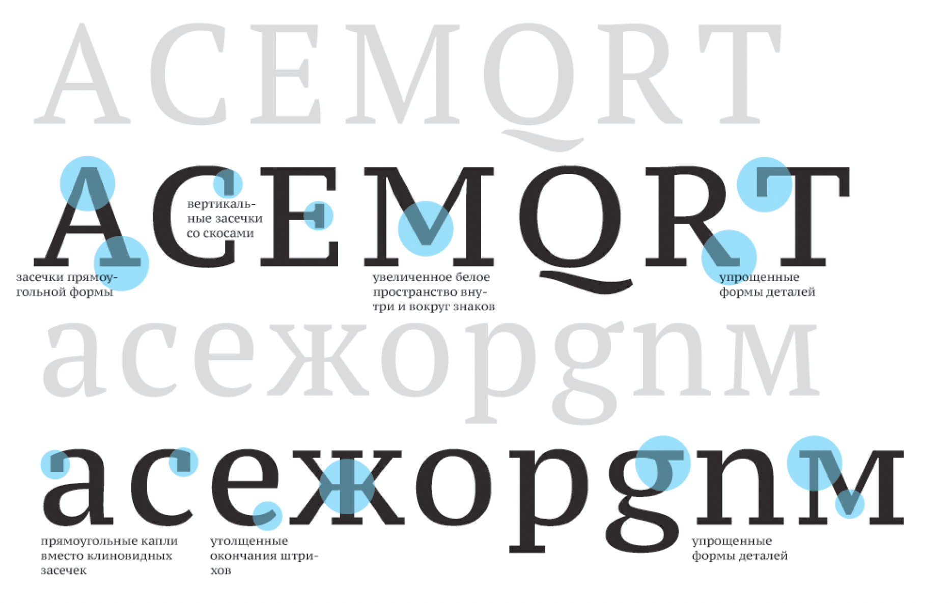
These decisions make the public-font project easier to picture. It was meant for correspondence, reference material, print, screens and the written furniture of a town. Its usefulness depended on how comfortably it met those different situations.
For Pavel Farář, writing about the fonts in 2011, the appeal included their treatment of both Czech and Russian. He had been searching for a free font that handled the two satisfactorily. An accent that seems minor to an outsider can alter the quality of an entire word. The project reached readers through precisely such details.
Yakupov’s part was to help organise a setting in which linguistic needs, visual decisions and engineering could meet. That required a company able to sustain the less glamorous stages between an intention and a usable file.
The business of introducing people
Paratype’s commercial relationships mattered, too. Connections with foundries including Bitstream, ITC, Linotype, Monotype and FontFont helped bring Cyrillic companions to established type families. A designer working across languages could have a broader palette.
Such work involves a particular kind of translation. A typeface has a visual character; another writing system has its own conventions. Extending one into the other asks designers to preserve a relationship without flattening the differences. The company’s contribution included both original Cyrillic designs and adaptations of existing families.
Yakupov carried the same interest in connection into the profession’s meeting rooms. He sat on the programme planning committee for the 2004 ATypI conference in Prague, whose theme was Crossroads of Civilizations. The programme called attention to Central and Eastern European design and its relationship with typography elsewhere.
The work extended beyond selecting speakers. A conference needs people willing to take responsibility for its programme, make introductions and connect a local community with visitors. Yakupov had a place in that machinery. The committee in Prague included designers and typographers from several countries, putting the interests of the region inside an international conversation.
In 2008, he helped bring ATypI to Saint Petersburg. He also organised Cyrillic type competitions with Yefimov. These were opportunities for designers to see one another’s work, develop a shared vocabulary and discover that a problem on one desk was interesting to someone at another.
Paratype becomes an independent company.
Growth in its font library during Yakupov’s leadership, through 2014.
Adam Twardoch remembered meeting Yakupov at the 1998 ATypI conference in Lyon. He, too, received a Paratype catalogue. Studying it helped him understand Cyrillic and drew him further into the subject. The apparently small gesture turns up twice in Yakupov’s story, in the memories of two different colleagues.
What stays on the desk
Twardoch recalled a reserved, modest colleague with a dry sense of humour. Phinney remembered his willingness to help others. Neither recollection requires a grand performance. There is a recognisable person here: someone you could sit beside at a conference and leave with something useful.
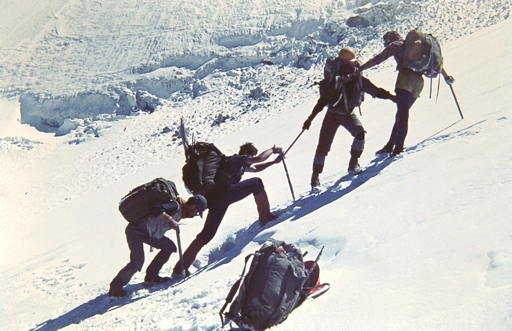
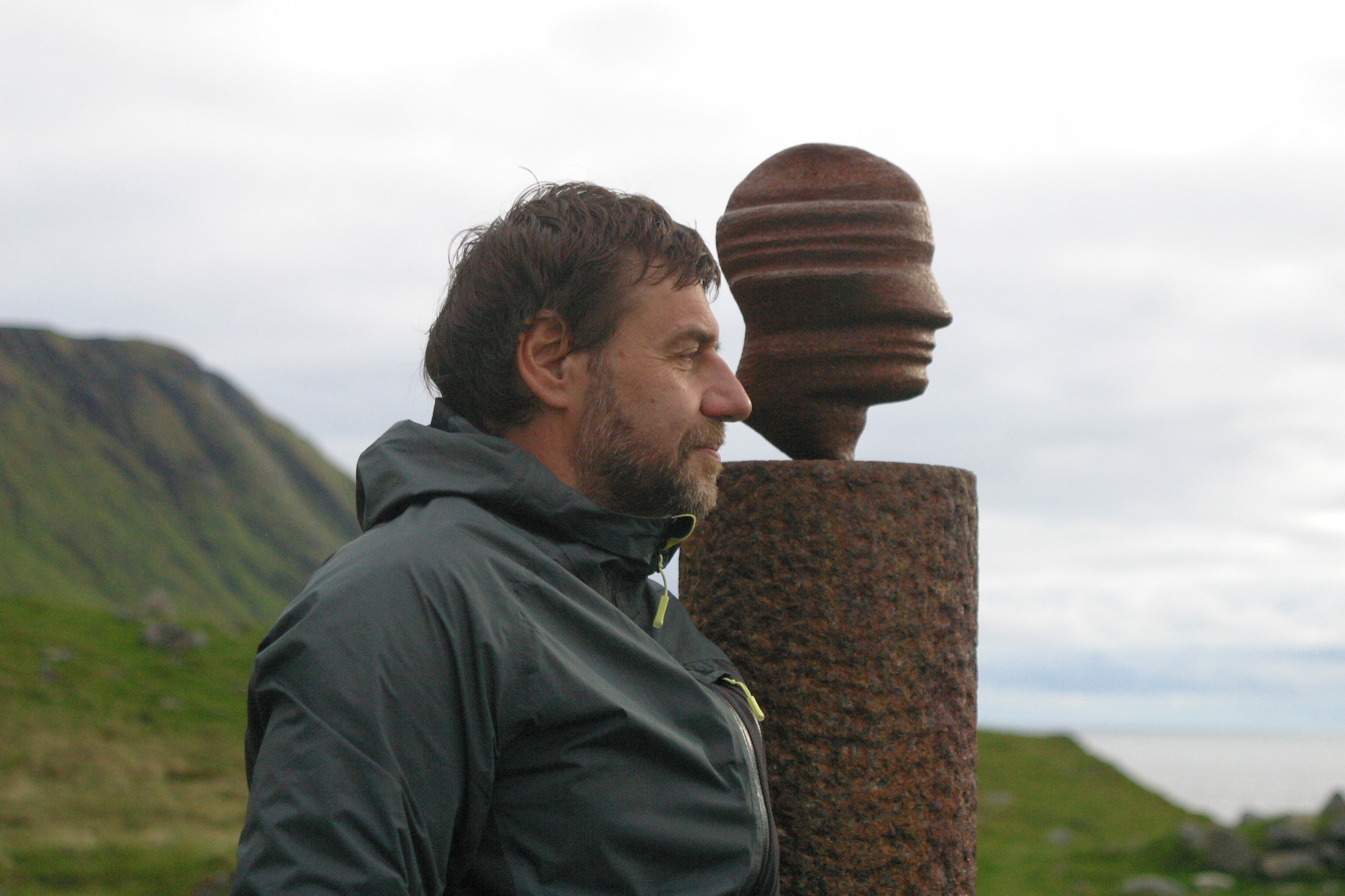
Typography also took Yakupov outside the office. An archival photograph places him in Iceland in 2011. The photograph from the Pamirs takes the view back to 1978. Between them sits a life with a wider horizon than the catalogue, even when the catalogue remained a persistent companion.
Yakupov died on 25 February 2014. The work continued beyond his lifetime. Modern Cyrillic 2014 followed the competitions he and Yefimov had organised; its selected entries later reached an exhibition at the Type Directors Club in New York. The conversation had acquired more participants and more places to happen.
The 2014 competition received 356 entries from 26 countries. Its international jury selected 29 for recognition. Those numbers describe a field with many people making work and others prepared to examine it closely. The exhibition opened in New York in February 2016. A competition begun around Cyrillic design could now place that work before an audience far from the offices where Yakupov had helped organise its predecessors.
In his November 2013 interview, he had expressed hope that the public fonts would help sustain linguistic diversity. That hope gives the files a purpose beyond their appearance. A well-made letter is useful when someone can choose it, put it beside the next one and say what they intended in the language they wanted to use.
There are several ways to count what he helped build: a library that grew sixfold, public fonts, research, professional relationships. The two catalogues offer a more intimate measure. They were given away, kept, opened again. Someone had made a difficult subject easier to approach. Years later, another person was still turning the pages.
Keep reading. Keep looking.
- Paratype’s retrospective and archive photographs
- Yakupov’s November 2013 interview
- The PT Sans, PT Serif and PT Mono project
- Thomas Phinney’s April 2014 remembrance
- Watch: SHANDESIGN’s documentary about Emil
- Watch: Yakupov’s 2009 copyright seminar
- Watch: protecting fonts, Serebro Nabora 2012
- Watch: the 2013 font-rental discussion
- ATypI Prague’s 2004 programme announcement
- Modern Cyrillic at the Type Directors Club
- Pavel Farář on PT Sans and PT Serif
- Chuvash-language coverage of the public fonts
- Yakupov and Mestetskii’s font-hinting paper
- Adam Twardoch’s recollection, preserved by Luc Devroye