An airline identity has to survive some undignified places: a boarding screen, a baggage policy, the little menu wedged into a seat pocket. Amalgam’s work for the revived Eastern Airlines reached all of them. The assignment stretched from aircraft livery to the website and the names of fares. Then the pandemic arrived, and the story the airline needed to tell changed almost overnight.
That is a useful introduction to this Malibu advertising and branding company. Its portfolio has famous faces and handsome packaging, but the more revealing detail is how often the work spills across departmental boundaries. Someone has to connect the promise in the advertisement with what a customer actually encounters. Amalgam has made that connecting work part of its pitch.
The agency calls its philosophy “Keep It Complicated™.” A mischievous line for a business paid to make things intelligible. The proposition underneath is more practical: preserve the interesting tensions inside a brand, then make its design, technology and communications work together. Its clients range from established consumer names to companies introducing unfamiliar products.
A new flight plan, then a world that stopped flying
Eastern offered a particularly demanding test. The revived airline wanted to serve overlooked international markets with nonstop routes and generous baggage policies. A familiar American name had to mean something to travelers whose connection with flying was personal: leaving for a new life, or returning to family.
This was a collaboration. Playbook Studio describes partnering with Mechanica and Amalgam, and researching both Eastern’s archives and the communities it would serve. Regional crew members helped inform the visual language. Topographic maps supplied a fresh perspective; the old bird symbol remained as a supporting element. Heritage became useful material rather than an instruction to repeat the past.
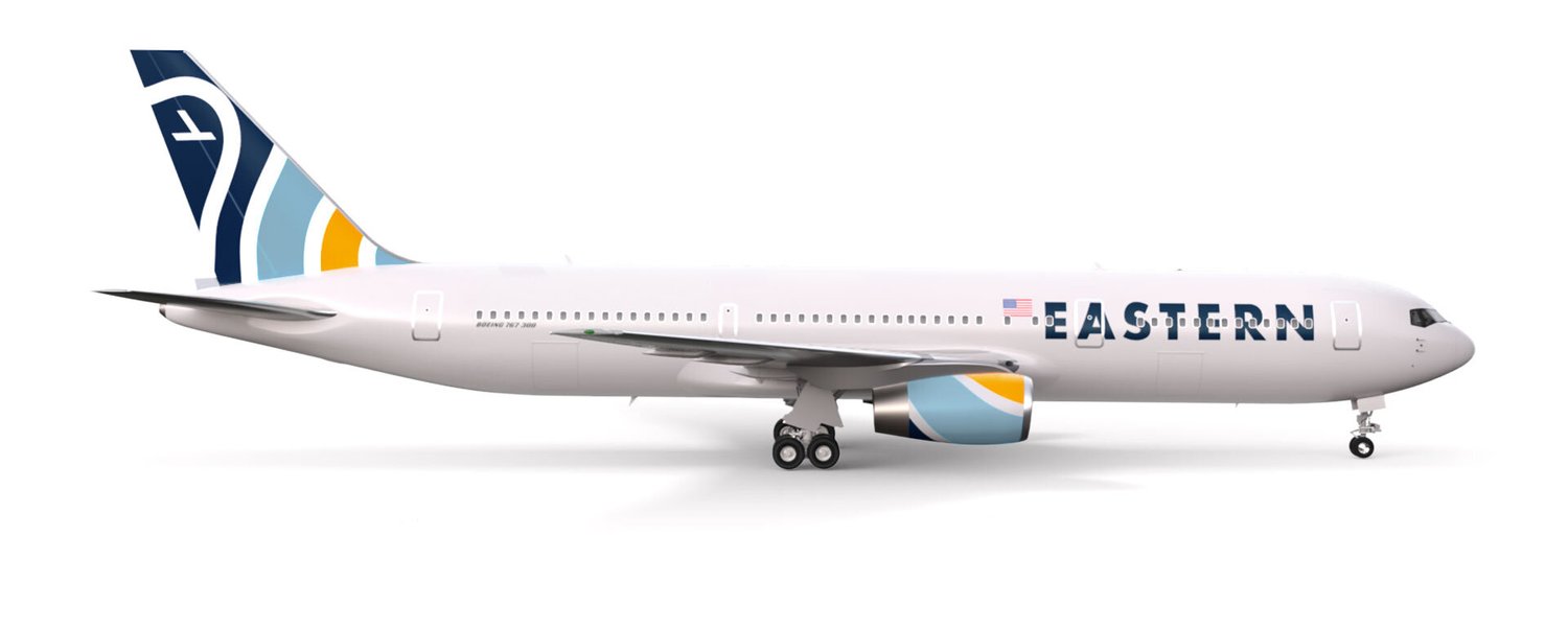
Amalgam then extended the identity into a brand book, digital experiences, onboard entertainment, social content and advertising. Its account also describes internal marketing leadership. This was a brief with an unusually long tail: an attractive plane needed an equally coherent experience on the ground.
When the pandemic stranded travelers, Eastern operated repatriation flights. Amalgam produced a thank-you film for the crews and frontline workers. The launch’s invitation to explore gave way to the immediate business of getting people home. The external event changed the communication; the agency did not need to invent a different personality for the airline.
For another company, the portable lesson is to build a brand around something it can actually do. A useful promise gives a marketing team room to respond when the original plan meets reality.
The old “R” still had work to do
Amalgam’s treatment of established brands is often less interested in erasure than in finding a neglected asset. Russell Athletic wanted to reach another generation. The agency made its familiar “R” an organizing feature of a renewed identity, with guidance for typography, color, imagery and voice.
That matters because a rebrand creates decisions far beyond the logo. A clothing company needs its campaign, label and retail presentation to belong to the same world. Russell’s case study connects the strategy with its spring 2019 collection and a Kith collaboration. The interesting mechanism is continuity: an existing mark gains another job with another audience.
Sheaffer supplied a smaller, almost comically economical piece of raw material: a white dot. A.T. Cross hired Amalgam to reposition the pen brand for younger buyers. The dot had once signaled a lifetime guarantee; the new interpretation made it a sign of authenticity and inspiration. The accompanying #WRITEON campaign asked a generation raised on screens to make something physical.
There is a lesson here for anyone tempted to throw away an old identity because it looks old. Before commissioning a replacement, inspect what customers already recognize. A modest symbol can carry a considerable amount of memory. The creative challenge is giving that memory a present-tense purpose.
A bottle that speaks fluent comic book
Sure Shot called for a different kind of intervention. In October 2024, the supplement business announced a change from Safety Shot to Sure Shot, with Amalgam leading repositioning and rebranding alongside Stout Design. Ned Wallroth, Amalgam’s founder, also served as the brand’s fractional chief marketing officer.
The new packaging used pop-art and comic-strip cues. Creative lead Mark Wenneker described changing a 12-ounce can into a four-ounce shot bottle and deliberately moving away from the soothing visual conventions of wellness drinks. The format and the name now told the same story.
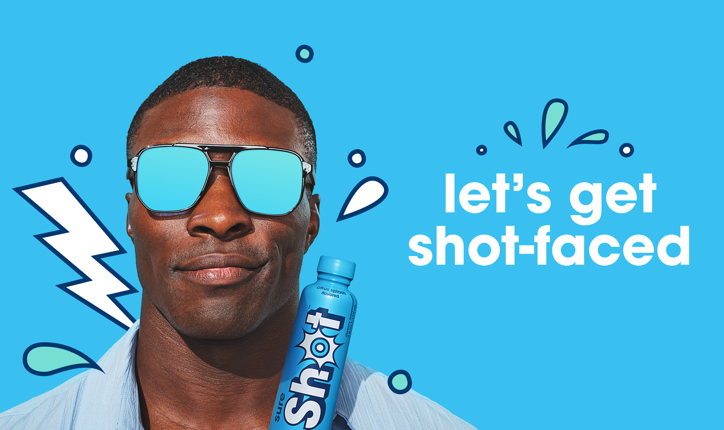
The company’s launch announcement listed the four-ounce bottle at $5.99. That was the product’s announced retail price, a useful reminder that the design had to perform on a small consumer purchase. A buyer would encounter a bottle, a name and a promise well before encountering a strategy presentation.
Amalgam carried the idea into a Halloween campaign featuring a vampire. The joke played on the product’s alcohol-reduction positioning. Considered as advertising, the connection is easy to follow: packaging supplies the visual language, the season supplies the character, and the campaign gives the product something to say.
The work illustrates how deeply an agency can enter a client’s business when its founder also occupies a marketing leadership role. It also shows why a package redesign deserves an operational conversation. A change in container size affects more than the artwork placed on it.
Celebrity works harder when the joke belongs to the product
For UNTUCKit’s spring 2019 campaign, Amalgam enlisted Drew Brees, already a brand investor and spokesman. The creative linked looking comfortable and put-together with making the right call. Football fans had a pointed reason to notice: the disputed officiating that helped keep the Saints out of Super Bowl LIII.
The agency reports a 66 percent increase in shirt sales associated with the campaign. That is an agency-reported commercial outcome, not a controlled estimate of advertising’s isolated effect. Still, the creative choice is instructive. The celebrity had an existing relationship with the product and a timely reason to deliver the line.
Absolut Juice took a different route with Lizzo. The campaign extended into an Instagram takeover and cocktail recipes on Pinterest. Amalgam reports 199 million impressions and 54 million completed video views. Those figures measure exposure and viewing behavior; they should not be mistaken for bottles sold.
Two measures of attention. Neither is a sales total.
Greatness Wins widened the assignment again. For the performance-apparel brand associated with Derek Jeter, Wayne Gretzky, Misty Copeland and Chris Riccobono, Amalgam describes developing strategy, an ecommerce site and a launch campaign. Its positioning emphasized sustained athletic effort. The store was part of the same assignment as the message that brought people there.
Electric products need a human reason to care
New technology presents another recurring problem in Amalgam’s work: how to describe an unfamiliar product without turning the advertisement into a specification sheet. Navier’s electric hydrofoil boats gave the agency an engineering story. Amalgam built the positioning around the experience of driving, using the line “Own the Edge,” and created a website to explain the technology.
The strategic judgment was to emphasize what the machinery lets the user feel and do. That is a useful distinction for a founder with an impressive technical demonstration and a less impressive answer to why somebody should want it. Engineering provides the evidence; the customer’s experience supplies the reason to pay attention.
Dodge presented a related challenge with different emotional baggage. Its electric-vehicle work had to address performance skepticism while preserving a recognizable muscle-car identity. Amalgam describes involving computer-generated imagery early and working closely with the automaker’s designers and engineers. The process connected creative development with technical accuracy before production was finished.
For Onyx Motors, the storefront itself became a rebuilding tool. Amalgam developed a Shopify site with detailed product pages and community content around custom electric motorbikes. Its case study identifies trust as part of the brief. That makes the website’s job bigger than processing an order: it must help a returning audience understand what it is buying into.
The business behind the broad brief
Amalgam sells professional services to companies. Its work combines brand strategy, design, digital development, content and media execution; individual engagements can include embedded marketing leadership. That puts it in the market between a specialist studio handling one discipline and a broader agency handling an integrated assignment.
Founder and principal Ned Wallroth leads a team whose current roster includes president Corrine Hendricks, creative lead Mark Wenneker and technology lead Peter Wallroth. The agency’s stated working model emphasizes continuity: people involved in the client relationship also stay involved in delivery. Its line for that approach is “Not a headcount, a who count.”
“Not a headcount, a who count”
Amalgam’s description of its team model
The partner credits complicate any picture of a self-contained creative shop. Eastern involved Playbook and Mechanica; Sure Shot involved Stout Design and production collaborators. Amalgam’s offer is partly the ability to assemble and connect the relevant skills. For a buyer, the practical question is who owns the joins between them.
Consider Pabst: Amalgam’s portfolio describes work across the beer company’s branding, packaging, websites, social channels and content. A company with several products can need consistency across that entire spread. A disconnected collection of individually good deliverables may still leave the customer unsure which brand is speaking.
The buyer who can use this approach has a connected problem and enough authority to act on it. If the brief concerns a new audience, the team needs access to customer knowledge. If the website is part of the problem, its owners need to participate. If only the advertisement can change, the wider brand experience will remain outside the assignment’s reach.
What readers can copy is the habit visible across the portfolio: begin with the customer encounter, identify the decisions it touches, and put those decisions into the same conversation. For Eastern, that conversation reached from a map on a tail to a flight home. For a pen, it began with a white dot. Size was never the most interesting part of the brief.