There is a particular instant in online shopping when optimism curdles. The product is chosen. The cart is full. Then the shipping cost appears, or the checkout demands an account, and the customer discovers that the easy part was merely an overture. Adam Christiansen has spent much of his career studying that instant. His work asks a practical question: what must a person see, understand or trust before taking the next step?
The Utah product designer's answer is rarely a flourish. It is usually a better sequence. At Jane, the e-commerce marketplace where he worked from 2017 to 2021, Christiansen audited checkout against established commerce patterns, watched session recordings, brought the evidence to stakeholders, built alternatives, and put them in front of customers. The process sounds almost suspiciously sensible. Product design, after all, has developed an impressive vocabulary for making common sense sound billable.
His portfolio gives the numbers their proper place. Guest checkout produced a reported 10.2 percent increase in gross merchandise value. An add-to-cart preview lifted the same measure by 2.4 percent. The broader set of checkout improvements added more than 15 percent. These are his published case-study figures, useful because they connect an interface decision to behavior rather than applause.
01 / TimingThe polite art of getting out of the way
Jane had a loyal customer base and reason to value registered accounts. It also had shoppers who wanted to buy without first joining a club. Christiansen's checkout work held both truths at once. The team tested six guest-checkout variations. The winning version let the customer continue, then offered account creation during review, after an email address had already been entered.
It was not an argument against accounts. It was an argument for timing. Ask too early and an invitation becomes a gate. Ask after the customer has done the necessary work and the same invitation can feel almost considerate. That small rearrangement says something about Christiansen's manner of design: persuasion works better when it respects the task that brought the person there.
The visible working loop
The add-to-cart problem was different but related. In research with roughly 700 Jane visitors and customers, shipping costs stood out as a complaint. Costs accumulated quietly while people shopped, then arrived in the cart with all the charm of an unexpected hotel fee. Christiansen and his team compared established patterns, designed variants, tested them with customers, and ran live experiments. The winning preview made the developing total easier to understand before checkout.
“I find that OOUX is a stellar way to quickly explore, identify, and scope out the core objects from a user experience.”Adam Christiansen, on his Seismic clips work
02 / EvidenceA portfolio that shows the argument
Christiansen's career began at Domo in 2015, where he moved from intern to mid-level product designer working on data and visualization features. The public trail still carries the visual souvenirs: logo motion, onboarding illustrations, small experiments in making business software look less like a municipal form. From there came Jane, then senior product work at Contracts, where his résumé describes an AI-assisted research tool for gathering data, creating personas and identifying opportunities.
A second Contracts project concerned Seismic Meetings, a product for reviewing recorded sales calls and exploring machine-generated insights. Beta customers were already leaving the product to make and share meeting highlights in rival tools. Christiansen's case study begins with that inconvenience, not with a screen he wanted to draw.
He compared conversational-intelligence and video tools, mapped the core objects, diagrammed the relationship between recordings, clips, content and sharing, then tried a reusable modal. The modal was tidy from a system perspective. It was less tidy for the people using it. Interviews made clear that the transcript was too useful for navigation to hide during clip creation. The design moved inline.
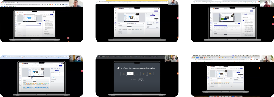
Six participants completed 18 tasks across one-hour sessions. The task-completion rate was 95 percent and the System Usability Scale score was 83. The tests also exposed confusion around saved clips and video playback. Christiansen simplified the navigation, clarified controls, and separated saved clips into their own page. He left Seismic before release, so the case study ends without borrowed victory confetti. Instead, it ends with a measurement plan: onboarding guides, feedback prompts, production testing and iteration.
That candor is more useful than a perfectly rounded case study. Product work often ends at a handoff, a reorganization or a change of job. The responsible designer leaves behind the reasoning, the unresolved questions and a way to learn what happens next.
03 / PlayThe night Figma became a table
The project that neatly explains Christiansen may not have had a roadmap. During the pandemic, he and his friends could no longer gather around The Duke, a tactical board game they loved. So he rebuilt it in Figma.
The challenge was wonderfully peculiar. The Duke is played from opposing sides, while Figma presents a one-directional canvas. Each piece also flips after it moves, revealing a different set of options. Christiansen made two pages, one for each player, then placed a locked, rotated instance of each board on the opponent's page. A move on one board appeared from the correct perspective on the other. Variants handled the hidden, front and back states of the pieces.
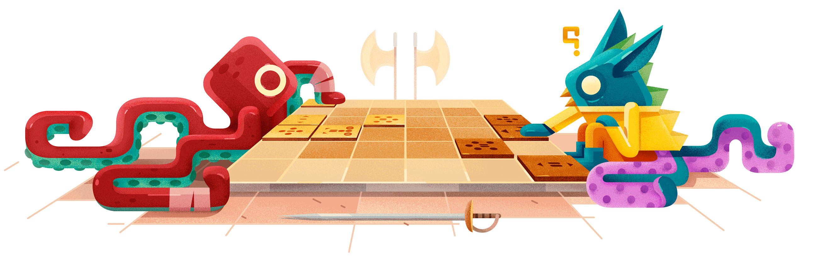
His developer friends Merrick Christensen, Dave Geddes and Joshy Robertson saw the potential and pushed it further. The manual setup was fussy, particularly shuffling pieces and returning them to the bag. A custom plugin automated resets and captures. The language in the write-up is gleefully allergic to solemnity. One awkward manual process is dismissed with a simple “Ewwww!” The point was not to prove that Figma could contain a board game. The point was to play.
“This mirroring trick makes it feel like your opponent is sitting right across from you!”Adam Christiansen, Board Gaming in Figma
Here the same professional instinct appears in miniature. Start with the human absence. Understand the constraints. Build a convincing model with no excess. Invite collaborators to improve what is tedious. Christiansen used a tool for something beyond the category printed on its box, but the experiment remained grounded in a social need: friends wanted their table back.
04 / ContinuityThe next move, from products to people
Alongside salaried design work, Christiansen founded Sluff in 2021. Its premise is pointed: stop documenting your social life and start living it. The small company describes an app that helps people find common ground with existing and prospective friends, then do something about it. Again, the desired outcome happens beyond the interface.
He also mentored UX Academy students at Designlab from 2022 into 2024, guiding research, ideation and design projects. Colleagues quoted on his portfolio describe a designer concerned with user needs, product goals and clear feedback, while remaining flexible and open to other people's ideas. Such testimonials tend to be generous by genre. These are at least specific about the behaviors they praise.
His July 2024 résumé placed him at nCino as a principal product designer focused on the adoption and consolidation of design systems. More recent professional listings place him at Awardco, the Utah software company whose platform handles employee recognition and rewards. The domain changes again, from banking software to workplace recognition, but the design problem remains familiar. Systems must be coherent, choices must be legible, and a person must know what happens after the click.
The company context adds an interesting wrinkle. Recognition software deals in gestures that are emotionally simple but operationally complicated. A thank-you may cross a department, a currency, a catalog and a compliance rule before it becomes a reward. Good design has to protect the warmth of the gesture while quietly managing the machinery beneath it. That is a fitting setting for a designer whose earlier work repeatedly translated systems into clear choices. The interface is not the appreciation itself. Its job is to let appreciation arrive without bureaucracy taking the lead.
His illustration background matters here, too. Christiansen earned a Bachelor of Fine Arts at Brigham Young University, and his older public work ranges from oil-painting studies to animated marks and onboarding scenes. Yet his later case studies are not portfolios of surfaces. They show diagrams, transcripts, audits and test grids. The visual education remains present, but it has been placed in service of sequence and comprehension. A handsome control that arrives at the wrong moment is still the wrong control.
A career can be reduced to company names, yet Christiansen's is clearer when read as a sequence of thresholds: the dashboard before insight, the cart before purchase, the recording before the useful clip, the social app before the friends meet. His distinctive work lives in that small interval between intention and action.
There is no theatrical philosophy required. Look closely. Give competing ideas a fair test. Accept when the first pattern is wrong. Keep the evidence near the drawing. Then make the next move feel so ordinary that nobody needs to admire it. They can simply continue.