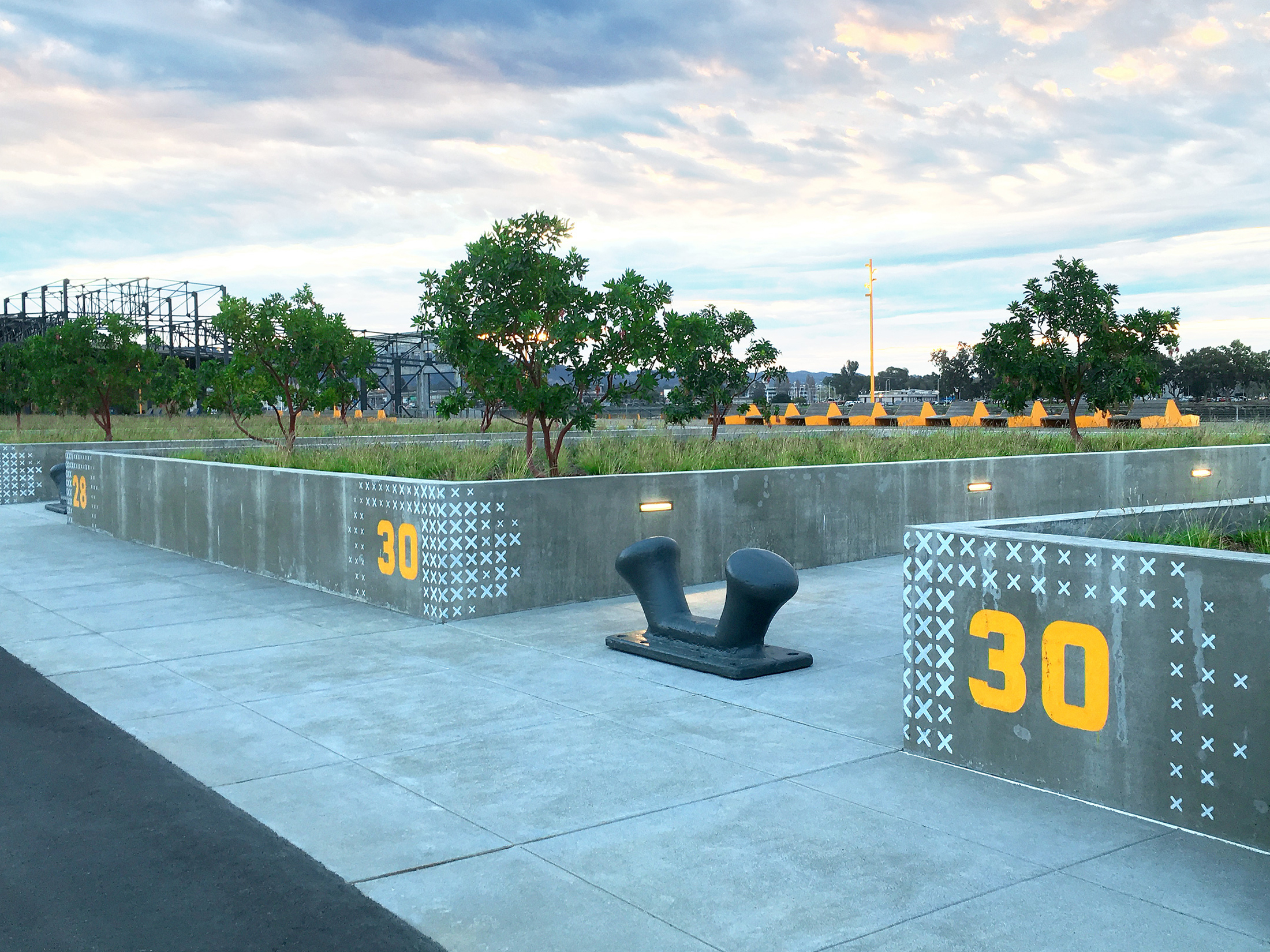
A painted x is a small thing to put on a waterfront. It is also a useful place to begin understanding Volume Inc. At Brooklyn Basin in Oakland, the studio helped turn an industrial site’s past into a visual language for its next life. There are directions, patterns, historical photographs, things to read while walking. The story of the place has become part of the equipment of being there.
That is a peculiar assignment for a graphic designer. It asks for more than a handsome mark. Where will someone arrive? What will they recognize? What belongs to this particular patch of ground? Volume’s answer lives across the site, in environmental graphics and interpretive panels developed alongside landscape architects EinwillerKuehl. New Bohemia Signs hand-painted much of the artwork. A place associated with industry acquired a new identity through the very physical business of putting paint on surfaces.
The customer buys a project. The visitor gets a place.
Volume works where branding meets the built environment. Its commissions include exhibition design, wayfinding, neighborhood identities and graphics for workplaces. An architect, a developer, a museum or a company can hire it to bring meaning and consistency to a setting that people must actually navigate. Its commercial output is commissioned design work, developed with the people who will build, manage and use the result.
The distinction between customer and audience matters. GitHub commissions conference graphics; attendees need to find a room. A city commissions an identity plan; residents need to recognize themselves in it. A cultural institution commissions an exhibition; visitors need an intelligible encounter with the objects. Volume operates between those needs. Its market position makes sense when the brief crosses the usual boundary between a visual identity and a physical experience.
Consider the range of collaborators. Volume can work beside landscape architects on a public site, event designers at a conference, or fabricators in a gallery. A buyer choosing among a branding agency, a signage specialist and an exhibition studio should first identify the problem. Volume’s portfolio is particularly relevant when those problems overlap.
Four weeks, and a room full of Eames
In May 2025, the Eames Institute asked Volume to design an exhibition at San Francisco’s Transamerica Building. It opened four weeks later. The show examined Ray and Charles Eames’s late furniture work, using pieces selected by curator Llisa Demetrios and the Institute’s existing brand standards from Manual.
A visit to the archives provided the organizing idea: furniture represents accumulated observation and experiment. Volume brought that process into the room. Color on the windows reached toward people outside; rulers on the plinths invited close attention to dimensions. The practical details made an abstract subject - how designers think - easier to inspect.
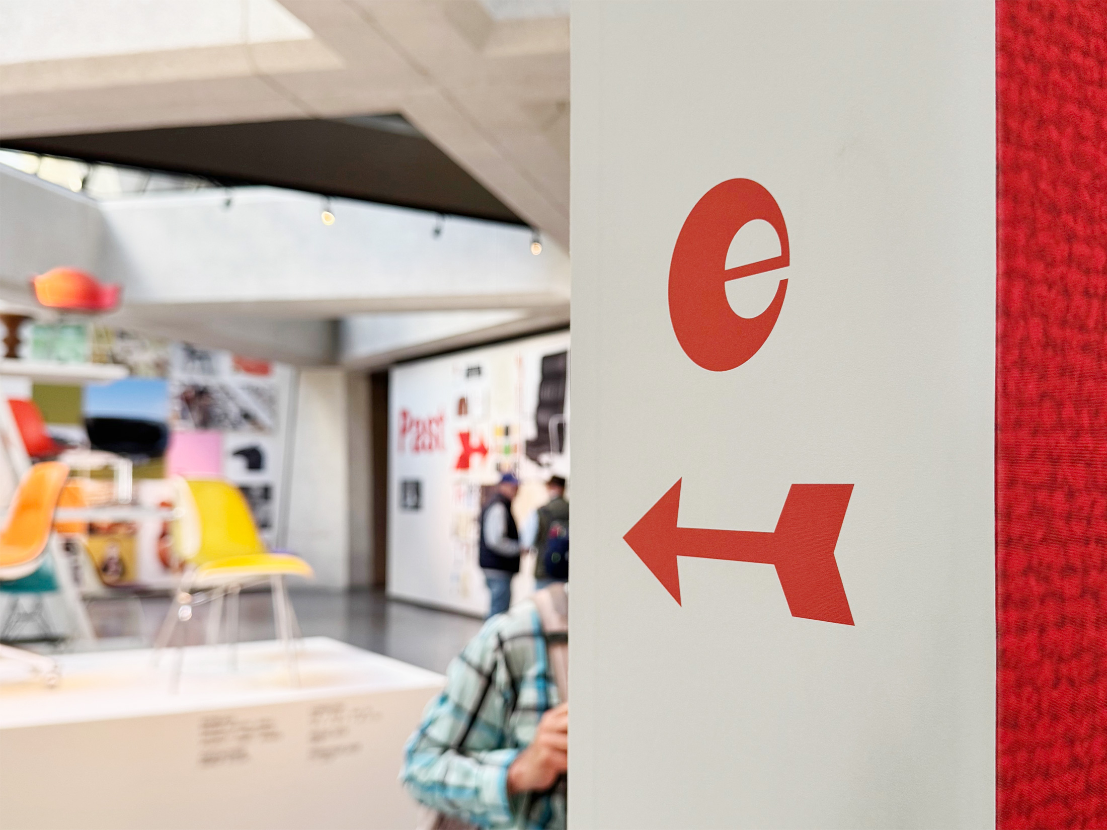
Volume later reported more than 40,000 visitors during the six-month run. In June 2026, it announced that the exhibition had won the Experiences / Activations category in the San Francisco Design Week awards, crediting its team, the Institute and fabricator BarkerBlue. Attendance measures the audience the exhibition reached. It does not isolate the effect of its graphic design. The speed of delivery is easier to grasp: a team had to make a coherent room, and the deadline arrived in a month.
A graphic designer walks into a bar
The firm’s beginning was less orderly. In a San Francisco Design Week interview, Eric Heiman recalled encountering Adam Brodsley in a bar on the night his last freelance job ended. They already knew each other through the local design community and teaching. Brodsley had recently left a long-held job. A few beers led to another meeting; working from their homes eventually led to a shared studio lease.
They founded Volume in 2001. Their skills already pointed toward physical space. Brodsley had worked on exhibitions and environments at Mauk Design. Heiman had studied architecture before graphic design. Publications and websites belonged in the practice, but so did the problem of what happens when a person enters a room.
“Design is for people, not Pinterest.”Eric Heiman, in Communication Arts
The line is funny because designers do have other designers watching. It also supplies a demanding test: does the work offer anything to someone who has never heard of the studio? A 2014 profile described a small team gathered around a communal desk, with regular idea sessions. Today, Volume’s careers page also welcomes freelancers and consultants. Collaboration is visible in the project credits as much as in the office.
The signs have to survive the party
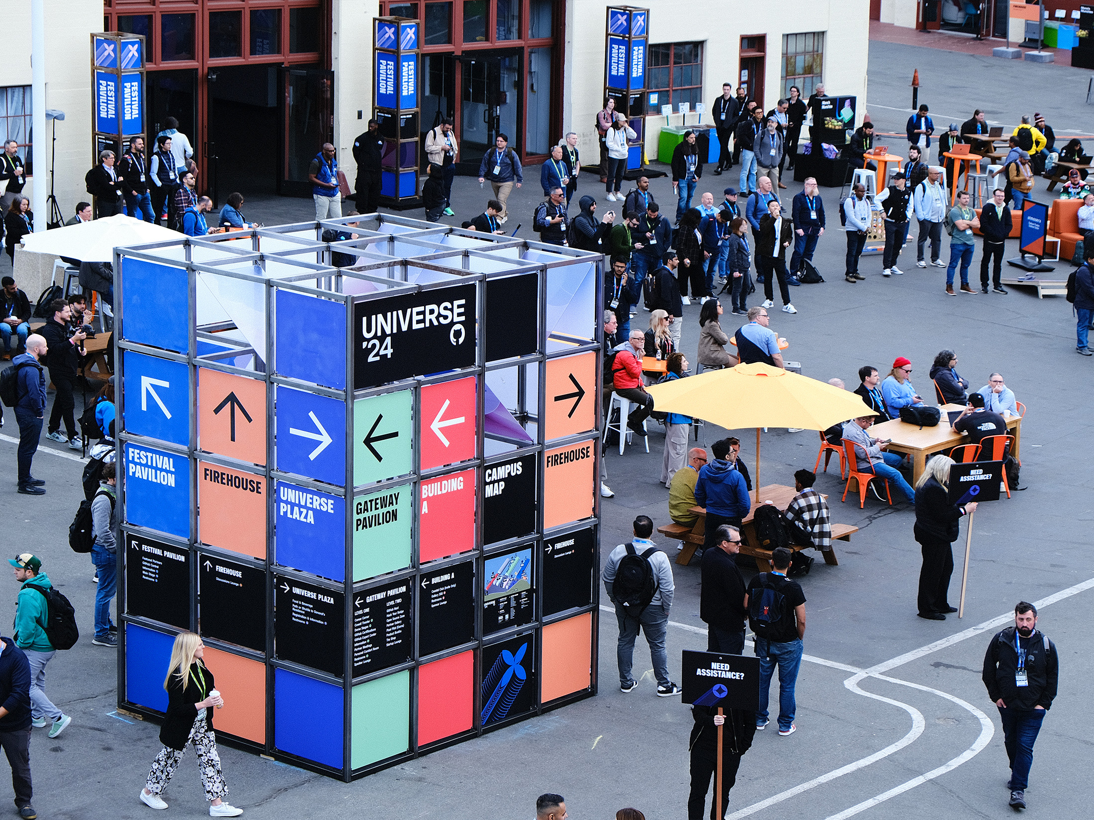
At GitHub Universe, the immediate difficulty was geographical. The conference occupied a larger Fort Mason footprint than before. Volume worked with GitHub and event designers Tinsel to translate a conference identity created by BUCK into a navigable environment. Historic expos and World’s Fairs informed the approach.
The project also contained a quieter decision. The steel structures were designed so GitHub could use them again when the conference returned the following year. That is a concrete way to think about resources: separate the durable support from the visual system that might change. The project account establishes the opportunity for reuse, rather than a measured saving.
Fort Mason’s own permanent wayfinding assignment exposes another part of this business. Volume devised the concept; Hunt Design developed and executed it. Volume distinguishes between the installed navigation system and more ambitious environmental ideas that remain unrealized. The first problem to solve was basic: people were getting lost. A useful installation can emerge even when the entire concept has yet to arrive.
An editorial reading of the projects, not a proprietary Volume framework.
The neighborhood gets a vote
In East Salinas, Volume worked with Urban Field and SWA on the Alisal District Identity Master Plan. After researching the area and talking to residents, the team presented three directions for comment, both online and in person. The community favored the building-block concept.
That response shaped the chosen system. Modular forms could combine into letters and patterns, with room for additional imagery. Proposed applications included banners and walls featuring local people. The distinction matters: the identity plan describes possibilities for the district, not proof that every pictured object has been installed. In July 2025, Volume reported that the collaboration had received an APA California Urban Design Excellence Award.
The public role is different again in the Harvey Milk Plaza proposal. Volume and SWA used community sessions to clarify what a memorial should do. The design emphasizes both reflection and action, with words, exhibitions and programmable elements. Its ambition extends beyond remembering a person to supporting a continuing movement. That also creates an operating responsibility: changing content needs people to select and maintain it.
Read the ground before drawing on it
At Pellier Park in San Jose, the subject was a fruit-growing past. Working with SWA, Volume created a 115-foot history wall about Louis Pellier and the valley’s agricultural development. Plum colors and fruit-crate stencil lettering supplied visual clues. A local history became the basis of the graphic system.
In West Virginia, a different audience required a different approach. The Sustainability Treehouse, with exhibits by Volume and Studio Terpeluk, had to compete for Scouts’ attention with activities such as zip lines and climbing. Camping cups became part of a rain-chain demonstration; a spinning wheel encouraged environmental pledges. The exhibit received a 2014 SEGD Honor Award. Its lesson is readily transferable: begin with what the audience already understands and enjoys.
Physical scale supplies another constraint. Reflecting on the California Academy of Sciences project, Heiman emphasized full-size mockups and the usefulness of a project manager. A room cannot simply grow extra pages when the content gets crowded. Test the work where a body will encounter it.
Those are the parts a reader can copy: walk the site, ask its users, build at actual size, plan for the next use. They demand access, time and cooperation. A team that brings designers in only after the physical decisions are fixed has fewer choices. The x at Brooklyn Basin looks simple when the paint dries. Getting to that simplicity means knowing which story belongs on that ground.