A company logo can look surprisingly pleased with itself on a map. Surrounded by semiconductor makers, software businesses and familiar corporate neighbors, it acquires a little local swagger. Silicon Maps has made that feeling into a product: a crowded, colorful portrait of an industry, suitable for hanging in the office. There is geography here, certainly. There is also the pleasure of finding yourself in the picture.
The company dates its first Silicon Valley map and calendar to 1989. Its business has since spread across technology and life sciences regions, combining graphic design, advertising space and corporate gifts. The name makes a fairly literal promise. As its own slogan puts it: “Put Your Company on the Map.”
Look past the cheerful artwork and a specific commercial arrangement appears. Companies buy participation, hand copies to people they want to impress, and receive an online presence alongside the printed one. The recipient gets something useful enough to consider keeping. The advertiser gets another chance to be noticed. The wall supplies the inventory.
A neighborhood you can mail
Silicon Maps occupies the territory between a design studio, an industry publisher and a promotional-gift business. Its expertise lies in composing corporate landscapes: fitting names, logos, buildings and regional identity into a picture that people can browse. The map provides a shared setting for businesses that might otherwise appear in separate brochures.
Its catalog gives that approach a vocabulary. Austin becomes Silicon Hills. Arizona is Silicon Desert. The Pacific Northwest gets Silicon Forest, while Dallas-Fort Worth appears as DFW Technoplex. Life sciences have their own series, including Bioscience West and Bioscience East. These titles make a region feel like a recognizable business community before the viewer has read every label.
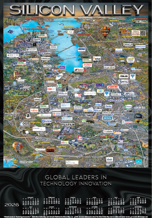
That framing suits several buyers. A supplier can send a map to existing accounts. A technology company can give copies to employees. A regional promoter can use one to introduce the businesses around it. Individuals can buy the artwork from the online store. Each receives the same broad subject, but has a different reason to want it.
The Silicon Valley sponsor list includes AMD, Analog Devices, Keysight Technologies, Sanmina and Pure Storage. That mix explains the niche better than an industry label alone. This is a marketing product for people who care which companies inhabit a technical community, including the less-famous suppliers behind the familiar names.
The price of appearing in the picture
The published Silicon Valley packages make the transaction unusually easy to inspect. Basic participation costs $1,995 per year. Silver is $2,495, Gold $3,495 and Platinum $3,995. A SEMICON West Sponsor package is listed at $4,995. These are advertised rates observed in September 2026, rather than a quote for every region or custom project.
The progression adds printed gifts and promotional services to map placement. Silver includes 50 large custom-imprinted calendar posters; Gold adds mini calendars and an expanded online profile. Platinum includes mouse pads and further promotion. New custom imprints, or changes to existing ones, carry a $250 setup charge. For a buyer, the practical question is which pieces will actually get used.
Retail serves another purpose. The store lists 2026 maps at $25, a Silicon Valley mouse pad at $16 and a 150-piece puzzle at $29. A casual buyer can own the corporate landscape without purchasing a promotional campaign. The same visual material becomes advertising, office equipment or an afternoon spent looking for a missing piece.

The calendar earns its wall space
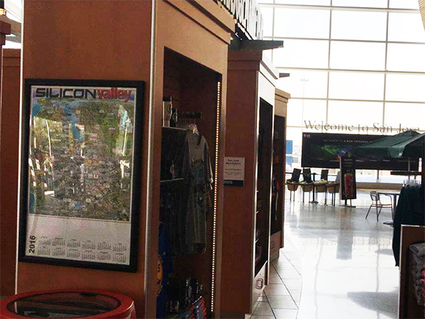
The calendar is an important part of the proposition. A company brochure asks for attention when it arrives. A year-at-a-glance calendar offers a recurring task: check a date. Attaching a promotional message to that task gives it a plausible reason to stay visible. Whether a particular recipient actually hangs it up remains the essential test.
Silicon Maps’ SEMI member profile describes customers distributing thousands of maps globally each year. Distribution through participating companies is central to the design. A business buying branded copies carries the wider map, including its corporate neighbors, into its own network. The publisher’s customers help deliver the product.
Its historical testimonials show how that can work. Ciena described sending maps to valued customers and employees. Sharp Microelectronics discussed using regional calendars at job fairs to make the Camas/Vancouver area and its technology employers more familiar to candidates. Those are different assignments: reinforce a relationship in one case, explain an unfamiliar location in the other.
A particularly revealing account came from a Silicon Valley Bank regional vice president. Some recipients apparently interpreted the map as a roster of the bank’s clients, or as recognition to aspire to. The testimonial explicitly corrected those assumptions. Paid presence can acquire a meaning the sender never intended. Buyers and readers both need to understand what inclusion represents.
“Put Your Company on the Map.”
Silicon Maps’ slogan
Málaga wanted a different postcard
The format also works at the scale of a city’s ambitions. In October 2011, Europa Press reported on an updated Málaga Technology Valley map that added 22 companies and institutes. Silicon Maps designed that edition and the previous year’s version.
The project belonged to the Open for Business Málaga campaign, bringing together the city, chamber of commerce and other local organizations. Distribution plans included 80 copies at MIT EmTech, international professional events and official visitors. The intended audience included people making judgments about where to work, study, research or do business.
Here, the map supplied an argument through accumulation. Each business and institute helped portray a place with a technology economy. A visitor could take that picture away and show it to somebody else. For a city promoting its industrial credentials, portability was part of the point. The regional story could leave town without losing its shape.
Behind each logo, another layer
The company also pursued ways to put more information behind the illustration. In September 2014 it announced BIOExplore for life sciences and TECHExplore for technology businesses. The launch descriptions offered three-dimensional virtual exploration, company profiles and media. TECHExplore promoted a fly-through experience connecting hundreds of companies.
The BIOExplore announcement named Map-N-Tour as a partner and described panoramic views, job information, videos and other company material. Mike Desrosiers, identified as Silicon Maps’ president, presented customization for regions, industries and organizations as part of the offering. These were documented product launches in 2014.
Today’s website provides a more direct illustration of the connection between paper and screen: an interactive Silicon Valley map, clickable logos and expanded company profiles. A logo can lead to contact details, business information or links. Where the printed map compresses an organization into a recognizable mark, the digital layer can let an interested viewer keep going.
This progression is a useful way to read the product’s development. The business repeatedly gives the same industry portrait another job: calendar, gift, digital directory, virtual tour or souvenir. The through-line is the company identity. The amount of information surrounding it changes with the medium.
A white outline is a business decision
The production instructions reveal the craft behind the apparent clutter. Silicon Maps asks for vector logo files, a high-resolution building photograph and appearance guidelines. Its art department prepares a proof, helps with the custom imprint and seeks final placement approval as autumn production approaches. The published schedule aims to put calendars in customers’ hands in November.
There is even guidance on the border around a logo. The company recommends a white outline so a mark remains distinguishable from its busy surroundings. It warns that rectangular white boxes can obscure the underlying map. That small instruction captures the design problem: every advertiser wants to stand out, while the picture still needs to hold together.
For a marketer considering the format, these details are actionable. Prepare usable artwork, select the right regional audience, decide who will receive the copies and budget time for approvals. Printing a gift is only one part of the job. Someone still needs to get it into the hands of a person who wants it.
Who actually wants the wall space?
Silicon Maps competes for attention and marketing budgets that could also go to trade advertising, conference sponsorships or other corporate gifts. Its particular appeal combines a useful object with a picture of industry membership. That proposition is strongest when the recipient recognizes the community and has a place to display the result.
It is less persuasive when a buyer needs immediate, attributable inquiries, when the target audience does not identify with the region, or when a poster has nowhere to go. Those are practical limits of the format, rather than evidence of a company failure. A calendar’s potential lifespan should never be confused with a measured business return.
The transferable idea is modest and concrete: give a marketing message something useful to accompany, then organize its distribution. Silicon Maps gives its advertisers a calendar and a neighborhood. The recipient decides whether that combination deserves a place beside the desk. After all the logos have been positioned, that is the placement that matters.