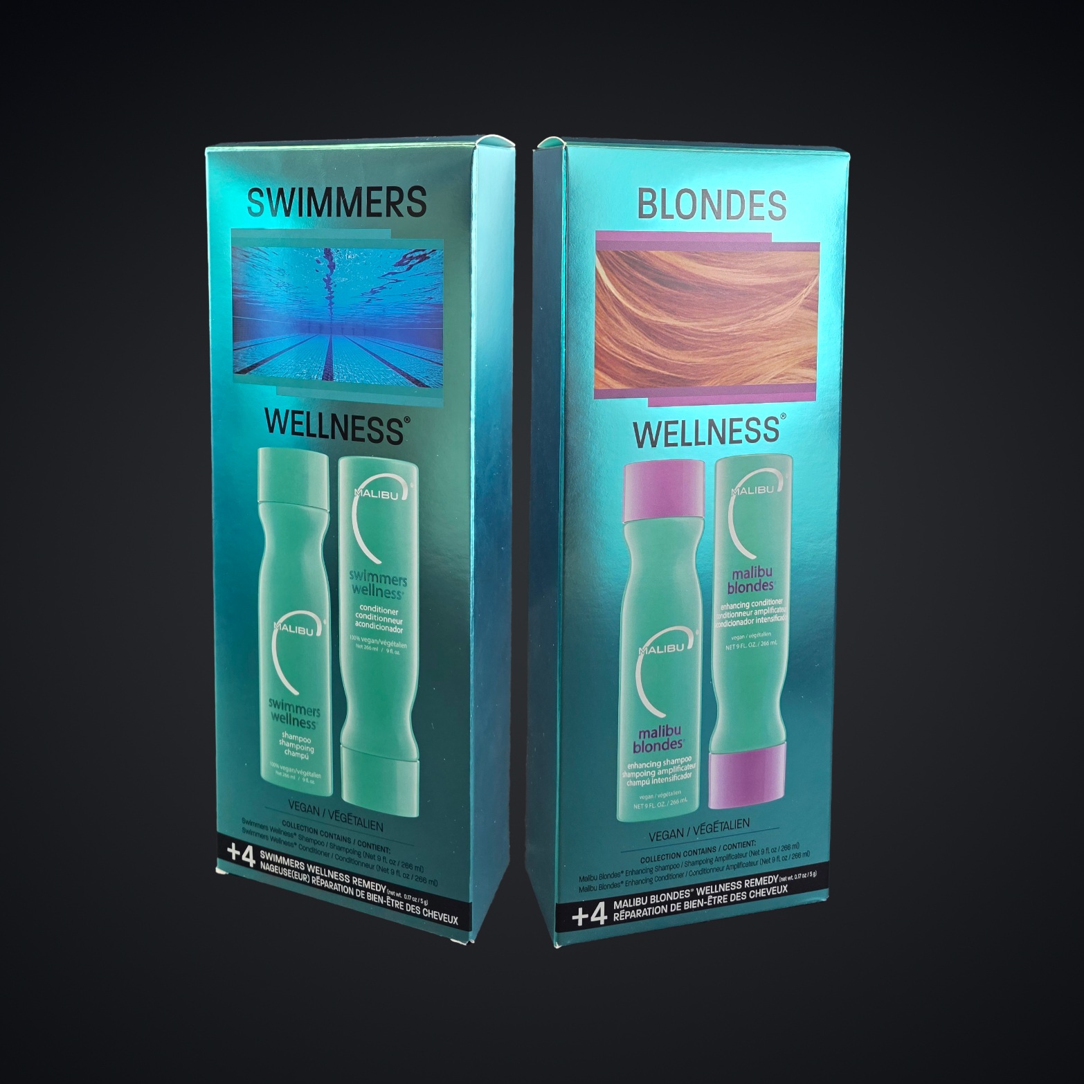
The plastic sleeve had a perfectly sensible job. It kept fingerprints from spoiling the appearance of a shiny carton. For Malibu Wellness, selling shampoo and conditioner duos, that meant another piece of packaging around the packaging. A small practical problem had acquired its own small plastic solution.
THE QUICK UNBOXING
- The business: custom cartons, rigid boxes, kits and displays for brands and agencies.
- The useful difference: structural design, print, finishing and fulfillment work together.
- The lesson: examine the reason for an extra layer before adding another one.
JohnsByrne proposed a different arrangement. Replace the laminated foil board with a recyclable foil board, free of plastic and laminate. Change the overall gloss to matte, keeping spot gloss where the imagery needed emphasis. The metallic appearance remained. The sleeve became unnecessary. According to the company’s case study, changing the surface helped eliminate the very problem the sleeve had been recruited to solve.
That is a useful introduction to this packaging manufacturer. Its work lives in the space between the thing a brand wants customers to feel and the thing a factory can reliably make. Sometimes the answer is more elaborate construction. Sometimes it is subtraction.
Less board, more control
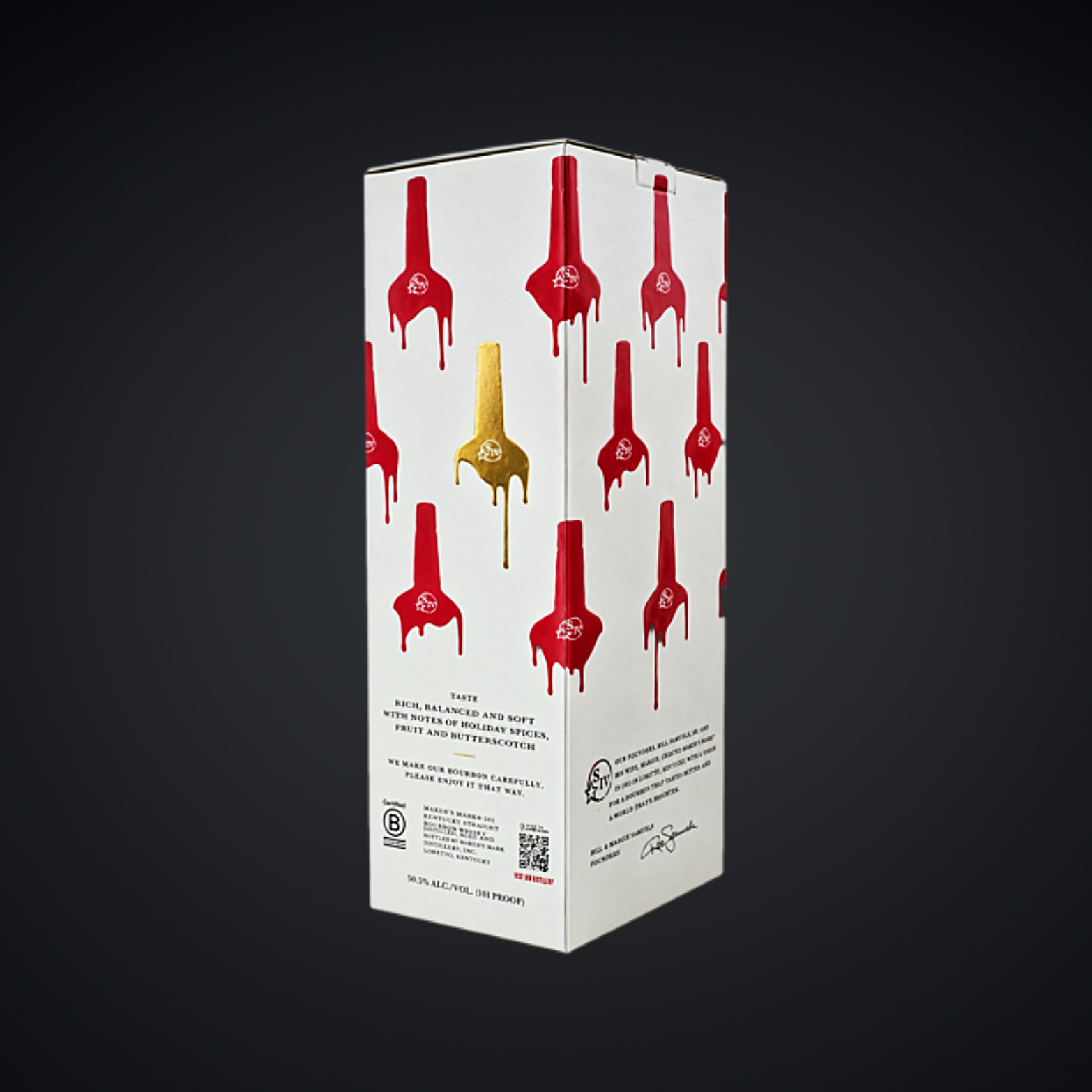
Consider Maker’s Mark 101 Special Proof. Working with adm Indicia and Suntory Global Spirits, JohnsByrne was asked to modernize the carton while preserving the visual force of the brand’s red wax. The previous construction was double laminated. The replacement used a single substrate: 28-point FSC-certified solid bleached sulfate paperboard, formed into an auto-bottom carton.
Printing on the uncoated side introduced a complication. A porous surface makes crisp, glossy details harder to achieve. JohnsByrne used clear foil instead of spot gloss, alongside gold foil, embossing, dull UV and repeated applications of matched ink. Heavy red printing continued inside. Simplifying the structure required more thought about the surface.
laminatedPrevious carton construction
substrateAuto-bottom carton, detailed finish
The practical distinction matters. A simpler carton can still involve demanding print work. JohnsByrne describes the result as efficient for downstream packing. For a buyer, the question becomes whether the whole package works: appearance, assembly, protection and handling together. Counting decorative effects alone tells you surprisingly little.
A bottle learns to float
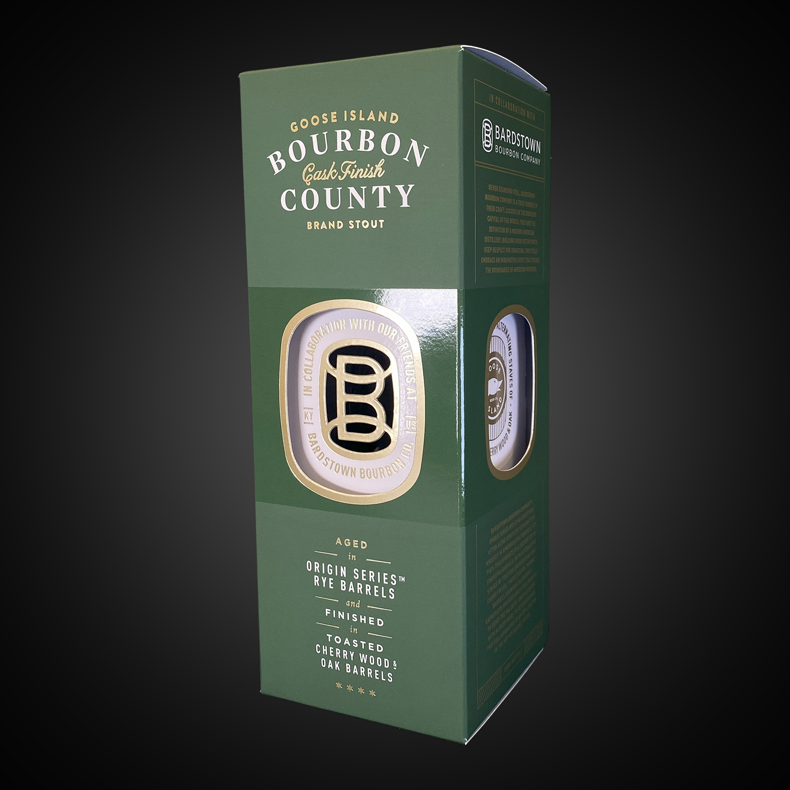
For Goose Island’s Bardstown collaboration, the assignment went in another direction. JohnsByrne and agency partner ADM created a folding carton that mimicked a rigid shadowbox. A box inside a box gave the bottle a floating appearance; an integrated insert held it in place. Green matched-color printing, gold foil, soft-touch coating and spot gloss supplied the finish.
There is a distinction here for anyone commissioning a package. “Premium” describes an intended impression; it does not specify a construction. A rigid-looking presentation can emerge from folded board. A metallic appearance can survive a material change. Those possibilities become useful when the brief describes what the recipient should see and do, while leaving room to reconsider how the package achieves it.
The package won Folding Carton of the Year in the 2025 Paperboard Packaging Council competition. Here was a folding carton borrowing the depth and presentation of another packaging format. The illusion depended on ordinary physical details: layers, spacing and support.
The factory joins the design meeting
JohnsByrne began on Chicago’s Printer’s Row in 1959, founded by John B. Gustafson and his parents, John E. and Marie Byrne Gustafson. It moved to Niles in 1987. Acquisitions of Chicago Printing in 2004 and Graphic Converting in 2005 expanded the manufacturing operation. Today its services stretch from structural design and prepress through printing, die cutting, foil stamping, folding, gluing and fulfillment.
“It begins by designing with the end in mind.”
Mike Drosos / JohnsByrne, 2022
In the company’s account of structural engineering, designers review concepts with the people who will manufacture them. Budgets, shipping, materials and automation enter the discussion early. The valuable habit is easy to borrow: let the person responsible for making something inspect it before the drawing becomes a promise.
Its pressroom includes an in-house ink lab and G7 color-management capabilities. Finishing includes Scodix digital enhancements as well as conventional foil and embossing processes. Oliver and Diamond Packaging offer overlapping capabilities in premium folding cartons. JohnsByrne’s case rests on how its particular combination of engineering, decoration and assembly serves a customer’s brief.
The work after the printing
That brief may extend well beyond a shelf. Citi’s Strata Elite welcome kit pairs a protective outer shipper with a magnetic rigid portfolio and a concealed well for a second authorized user’s card. For Dell, working with BDA, JohnsByrne developed a box opened by combination sliders. Recipients scan a QR code to obtain the combination. Opening becomes an activity.
For beauty brand Live Tinted, the relationship began in March 2022 and included packaging work ahead of its Ulta Beauty expansion. The Hueliner launch also needed an assembly plan that met market deadlines. An attractive carton is only useful if the finished kits arrive in time.
GHK Capital Partners acquired JohnsByrne in October 2023. In December 2025, JohnsByrne bought Municipal Packaging, adding two facilities and 75 employees, according to the announcement. The expansion broadened its West Coast presence and display capabilities. In October 2026, the company announced seven PPC awards, including a Judge’s Award for its Goose Island Heaven Hill Bottled-in-Bond package.
The financial comparison deserves the same breadth as the design review. For a buyer evaluating quotes, board and printing sit alongside tooling, assembly, storage and shipping in the purchasing decision. Removing a sleeve changes an operation as well as a material. Adding an opening mechanism creates an experience and another production requirement. Ask for samples and evaluate the complete sequence before choosing the finish.
For a brand considering JohnsByrne, the useful starting point is a project brief: contents, quantities, budget, opening sequence, shipping requirements and deadline. Its business is custom manufacturing sold through quotations. The fit depends on whether the product needs the engineering and finish being proposed. A simple commodity carton may call for a different purchasing decision. A beautiful prototype still has to survive production, packing and delivery. That is where the box earns its place in the product.
Open a little further
WORK, PEOPLE & IDEAS
SEE THE MACHINERY IN MOTION