Bono declined. That is the essential plot of a small, unusually revealing story from Ignacio Soffia’s years at Fintual. The team wanted the U2 singer to record five seconds of advertising built around a Spanish pun: Bono asking people to invest their bono, or bonus. They found a contact. They made the request. The answer was no.
Soffia later told the story himself, cheerfully preserving the failed pitch. A financial product needed to explain itself, and someone thought the explanation might be better with a joke. There is something useful in that little episode: a designer willing to treat communication as part of the product, and willing to admit when the joke failed to secure its leading actor.
Years later, at Faces, the object of his attention would be the presentation itself. A slide could contain a working form, a map or a product demonstration. The audience could do something with it. For a designer whose work has moved between interfaces, brand identities and writing, that was a familiar problem in a different rectangle.
Two Ignacios, one admissions problem
In 2016, Soffia and Ignacio Villagrán were already building for a problem they knew personally: navigating Chile’s university admissions process. They created InfoPSU after facing the PSU entrance examination themselves. Information about courses, universities and entry requirements was scattered. Their app collected it into a place a student could actually use.
The details were practical. Students could record practice-test scores, compare their performance with the requirements of a desired course, browse university information and estimate scores with a calculator. It was free on Android and iOS. A decision that had required repeated trips through university websites could begin with a phone.
The pair won the education category of the TuApp competition, joined Imagine Lab and obtained support through a Corfo SAAF fund. By November 2016, the app had passed 10,000 downloads in less than a year. Soffia was 18. Before the presentations and the AI experiments, there was a teenager helping other teenagers make sense of a consequential choice.
A logo, twenty illustrators and a very human voice
Soffia studied at Pontificia Universidad Católica de Chile and joined Fintual in 2019. He became its head of design. In his account of the company’s new logo, published in September 2020, he recalled arriving to find an established personality before there was a fully developed visual identity. The service already spoke with an approachable voice. Design had to give that voice a coherent appearance.
His advice to a young business was unexpectedly economical for someone discussing a redesign: make an inexpensive logo if necessary and concentrate on getting the business to work. Building a brand deserved attention from the beginning; polishing its symbol could wait. The distinction put the company’s behavior ahead of its stationery.
For Fintual, he described a symbol organized around investment, transparency and people reaching their goals. Its destination mattered too: app icons, browser favicons and social profiles. Those small spaces helped determine its structure. The argument was concrete enough to inspect, rather than an invitation to admire a mysterious flash of inspiration.
A separate illustration project showed a more expansive side of that judgment. To improve Fintualist’s financial explanations, the team invited Latin American illustrators to submit portfolios. More than 300 applied from eight countries in under two weeks. The initial plan called for twelve artists, each making an illustration for $100.
Soffia and colleague Nicole reviewed the portfolios individually. Their selections overlapped in eight places; together, they had a group of 32. They eventually increased the number of commissions to twenty. The blog could become a small gallery as well as a place to learn about money. Even its production process made room for more than one visual voice.
“functional yet delightful”
Ignacio Soffia, describing his approach to Fintual’s visual identity, 2020
The distance between a drawing and a working button
By 2022, another design problem had become harder to ignore. A carefully considered interface could change on its way from a designer’s screen to a developer’s implementation. Spacing drifted. Lines differed. Animations added another opportunity for disagreement. Several people could produce work that looked almost consistent, which is a particularly durable form of inconsistency.
Soffia presented Fintual’s response with Martín Bravo of Design Systems International at Chile Diseño. Their subject was a shared design system: reusable interface pieces and a common way for designers and engineers to work. The humble button received serious attention because it would appear again and again. Getting it right once could spare everyone repeated negotiations.
The talk located design partly inside working software. Transitions, interactions and accessibility could not all be settled in a static drawing. That makes the later Faces experiment easier to understand. Soffia had already been dealing with the gap between a visual intention and what a person could actually experience on screen.
The fourth colleague was supposed to be software
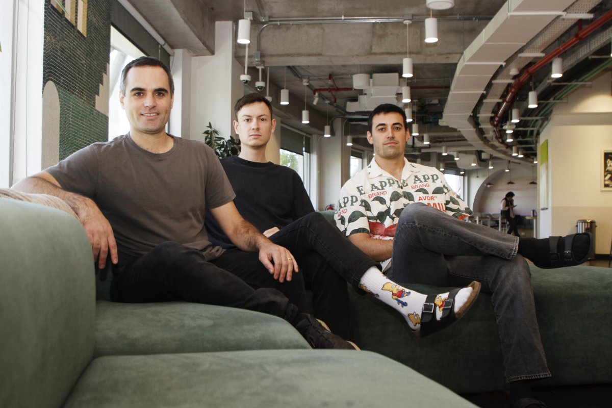
At Fintual, Soffia met Gonzalo Enei and Joaquín Ossandón. Enei worked on growth; Ossandón was a software engineer. Conversations about a new company developed into plans, including weekend gatherings where they sketched ideas. In 2023, the three left to start Perhaps, with Soffia as chief product officer.
Their departure came with an encouraging shove. After they told Fintual’s founders, the team was urged to get started immediately. Perhaps entered Platanus Ventures’ accelerator. The name, Soffia explained, invited possibility. The first possibility they pursued was a colleague made entirely of software: a fourth employee for a three-person company.
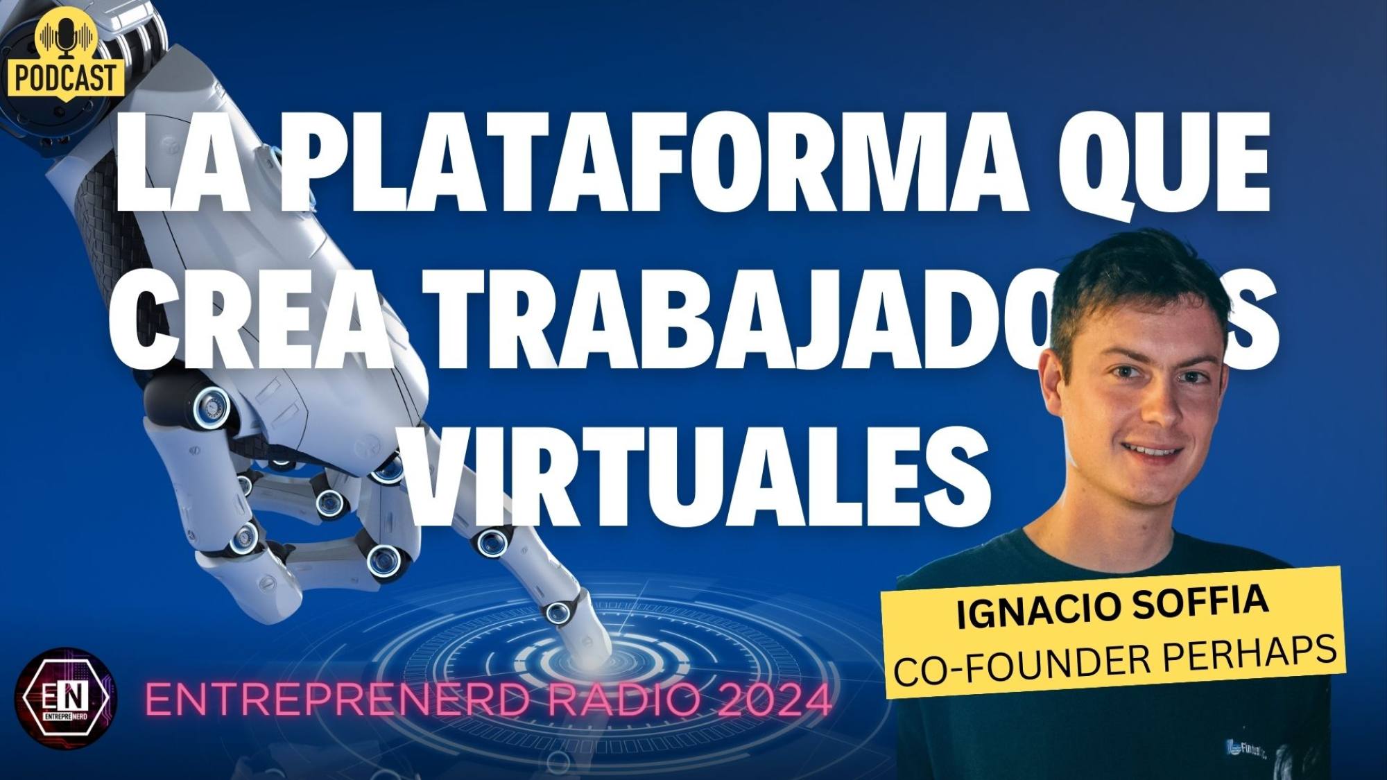
By February 2024, he was describing assistants that could learn a company’s internal information and carry out tasks. The team’s own test was a salesperson that could research prospects, match their needs with Perhaps and prepare personalized outreach. They were using their own small company as a demanding customer.
He framed the aim as increasing what a team could accomplish. At that stage, he said product usefulness mattered more to them than optimizing usage or revenue figures. These were ambitions and experiments, with an internal beta still being developed. The distinction matters: the founders were working toward autonomy, rather than presenting it as a completed achievement.
A slide with somewhere to go
Faces brought the work toward communication. On June 2, 2026, Soffia introduced Faces II, a presentation tool whose slides could run software. A deck could include an interactive map, a live chart or a real product demonstration. Instead of showing a picture of an experience, the slide could contain the experience.
He also described the unglamorous controls that make an ambitious format usable. People could adjust a deck’s colors, typography and layouts through a design panel, or import a PowerPoint or PDF. Existing material had a way into the system. Presentations could appear as cards or full-screen slides, with horizontal or vertical navigation.
There was a pleasingly literal piece of interface design: scan a QR code and a phone became the presentation remote. Its trackpad let the presenter reach interactive elements inside a slide. The device controlling a presentation needed more to do once the presentation had more to do.
In a separate guide, Soffia explained how an embedded form could collect information without sending the audience to another page. A pitch could accept a lead; a talk could gather responses. When published on the web, those interactive elements remained available to the people opening the link. Sharing became part of the experience’s design.
The accompanying publishing guide made the audience’s route explicit. A presentation could be shared with teammates for viewing or collaboration, or published as a browser link. Forms, embeds and live elements continued to work in that published version. That practical distinction gave the idea of a software presentation a destination beyond the editor: something another person could open and use.
His July guide to speaker notes addressed the other person in the room: the presenter. Notes saved while being written. A separate window kept them visible alongside presentation controls, while the audience saw the full-screen deck. For all the possibilities of software slides, somebody still had to remember what they wanted to say.
A closing date, and another place to build
Soffia took over as CEO after Enei stepped away from Perhaps/Faces. In his public response to the handover, he described accepting the role with humility and responsibility. The transition put the designer who had helped build the product in charge of the company around it.
By October 2026, the direction had changed again. Soffia and Ossandón joined Conductor, and Soffia’s personal website now identifies his work as leading design there in San Francisco. On October 13, Faces announced its sunset. New registrations closed; existing projects could continue to be edited, presented and shared through December 31, 2026.
The closing plan included two ways for users to take their work away: a React application ZIP and a single HTML file. That is a fitting final detail for a product built around software as a communication format. The service had a closing date. The presentations had export options.
Away from the screen, Soffia enjoys cycling long distances. His account of the 2025 Across Andes Volcano Edition records an 800-kilometer, self-supported race through southern Chile’s volcanic landscapes, completed in three days. It is an unusually literal entry in a portfolio otherwise full of software: a distance, a route and the time it took.
The career now contains several different kinds of unfinished business: an admissions question turned into an app, a financial service given a visual vocabulary, a presentation allowed to behave like software. Conductor is the current workplace. Faces is approaching its last day. Soffia is still designing what happens when someone reaches the screen.
 Watch the 2024 interview ↗
More from Ignacio’s working notebook
Writing, conversations and the next place to find his work.