Four extra pages can be a surprisingly revealing business decision. For Hill Design, the Saratoga graphic design agency associated with Patricia Hill, they were part of a concrete assignment: give a golf association’s newsletter more space and a fresher appearance. In early 2003, Hill outlined a change from 12 pages to 16, with full-color front and back covers. The publication was Thru the Green. Its readers worked in a business where the condition of the grass mattered considerably more than the fashionability of the typography.
That makes it an interesting place to look at design. A specialist newsletter has jobs to do. People need to find announcements, recognize colleagues, understand technical material and notice an advertiser without losing the article beside it. A designer has to make those competing needs coexist. The result may never hang in a gallery. It still has to earn its place on someone’s desk.
A new publisher, then a bigger brief
The assignment began with a handover. In October 2002, association executive secretary Barb Mikel welcomed Hill Design as the new publisher, identifying September as Hill’s first issue. Outgoing publisher Jo Harlow of Key Publications was retiring after a tenure that began in 1995. Mikel thanked Harlow for her work and expressed confidence in the incoming designer. This was an established publication passing to a new pair of hands.
The distinction matters. A redesign can be a rescue, a routine update or the next stage of a working publication. Here, the contemporary account describes continuity and ambition together. There was an existing audience and a publication worth carrying forward. For a creative agency, taking over that sort of job means inheriting expectations before proposing changes. The readers already know what the thing is for.
Hill’s subsequent publisher’s note set out the physical scope of the new version. There would be a larger issue, color on the outside and an updated layout. She also thanked the committee and affiliate members who had supported the publication. The brief had identifiable outputs and identifiable collaborators. That is useful discipline: a client can examine a page count and a cover treatment far more easily than an abstract promise to improve its image.
Four additional pages. Full-color front and back covers.
A service list with dirt on its shoes
Hill Design described itself in its advertising as an advertising and marketing agency. A September 2002 notice identified Patricia Hill as principal and promoted corporate campaigns across print, new media and web design. Another advertisement listed the everyday materials of business identity: logos, brochures, annual reports, illustration, packaging, displays and advertising. The practice sat in the market for commissioned visual communications, serving organizations that needed things designed and produced.
The breadth is familiar; the setting gives it character. Hill’s advertisement appeared among businesses selling irrigation expertise, turf products and other practical services. Its prospective audience did not need a lecture on creativity. It needed to know whether the agency could help communicate an offer. In that setting, listing a brochure or a display is a direct answer to a purchasing question.
By March 2004, the agency was advertising explicitly to the golf and green industry. Its menu included score cards, shirts and hats, menus, signs, direct mail, web design, exhibits, banners and posters. A score card is a particularly nice detail. It puts graphic design in someone’s hand while that person is doing something else entirely. Legibility has to survive distraction. The designer’s work should not require an explanation before the next tee.
Read as positioning, that service list suggests an agency translating broad capabilities into a customer’s vocabulary. “Marketing collateral” is an industry category. A menu or a hat is something a buyer can picture. This is an editorial inference from the advertising, but it offers a useful lesson for service businesses: describe the object the customer needs, as well as the expertise used to make it.
The page has several bosses
The newsletter’s credits show a division of labor. In the November/December 2003 issue, Patricia Hill is publisher; Kenneth D. Williams is editor; Barbara Mikel is association manager; and Emmy Moore Minister handles public-relations consulting. Those are distinct responsibilities. The publication had organizational news, technical reporting, member material and advertising to accommodate. Producing it meant working within a small editorial institution.
A surviving illustration makes the creative contribution tangible. Alongside a report about chapter delegates, a montage combines a man’s face with gears and meeting-related words. The credit names Tricia Hill, Hill Design. It gives a report about organizational business a visual entry point. The subject is a meeting; the picture supplies a little theater. Anyone who has tried to illustrate committee work will recognize the problem.
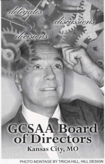
The image also gives a prospective client something more useful than a list of software skills: an example of interpretation. A report arrives with facts. A publication designer must decide what deserves emphasis and what image will help a reader enter it. That judgment sits between editorial understanding and visual craft. It is one reason a commissioned design service can be useful even when a client already has the words.
Hill’s public professional profile adds another dimension. It lists Adobe software certification through UC Santa Cruz and later web-related study through Stanford, including HTML5, CSS, interface design and WordPress. These are self-reported credentials, and they describe the practitioner rather than every service the company supplies. Together with the historical advertising, they place print and web within the same professional story.
The budget sentence deserves a close read
The client’s year-end response supplied the sharpest business detail. In the November/December 2003 newsletter, Mikel praised the publication’s improvement under Hill Design and reported compliments. She also wrote that it “has come without additional membership revenue.” For an association, that is a meaningful way to describe a creative project: the benefit was discussed alongside the demands on its members.
“has come without additional membership revenue”Barb Mikel / November–December 2003
The wording is precise. It establishes a statement about membership revenue. It does not establish the agency’s fee, the printing bill or the total cost of producing an issue. A buyer assessing the example should keep those measures separate. A project can fit within an organization’s resources while still involving paid professional work and production expenses.
There is a broader lesson here about asking better questions. “Did the redesign work?” is too loose on its own. Did the publication provide the agreed space? Was the new format delivered? Did readers respond favorably? What did the organization have to fund? These questions concern different results. Combining them into one vague success claim makes a case study sound bigger while making it less useful.
For Hill Design, the documented client response gives the story a modest but concrete outcome. The association was pleased enough to say so in its own publication. That is valuable evidence of the relationship, with a sensible boundary: praise from a client is evidence of satisfaction, not a substitute for a readership study or a financial return calculation.
What a buyer can borrow
The most transferable part of this assignment is the shape of the brief. Begin with a publication people already use. Name the physical changes. Give the editor, designer and organizational contact distinct responsibilities. Decide what a satisfactory result should look like before commissioning it. These are practical conclusions drawn from the case, rather than a claim that Hill Design used a proprietary process.
For an association weighing a similar project, the first conversation should concern the next issue. Which material struggles for space? Which recurring items need to be found quickly? Who supplies photographs? Who approves a late change? A portfolio helps establish taste, but answers to those questions help establish whether a designer understands the assignment. The work has to survive the ordinary complications of publishing.
A useful brief can also separate the launch from the routine. Agreeing on a new visual direction is one decision; arranging how the next issue will be assembled is another. A commissioning team can ask for both a sample layout and a clear account of the handoff. That makes the conversation about the publication people will actually receive, including the less glamorous work that happens after everyone approves the look.
The same logic helps distinguish alternatives. An internal communications team brings organizational knowledge. An independent designer may suit a tightly defined piece of work. A publication specialist may be useful when layout and issue production dominate. A broader agency can be considered when the newsletter belongs to a larger set of branded materials. The right comparison starts with responsibility and scope.
Extra pages, however, only help if there is material worth putting on them. Color needs appropriate images and a production budget. A redesign needs timely decisions from the client. These conditions follow from the assignment itself. For a buyer, they turn an appealing example into a workable conversation. Hill Design’s newsletter story leaves a useful object to examine: an ordinary publication, given specific attention, for a particular group of readers.