A school bus is an unusual supporting character in a design studio’s history. Yet it belongs in the story of MAX Design Studio. After the September 11 attacks depressed the travel business, illustrator Max Seabaugh took up driving children to school. He worked the morning and afternoon runs and returned to his studio in between, maintaining that arrangement for more than a decade. His published biography records the schedule with matter-of-fact economy.
It is a useful place to begin because MAX’s work is equally concrete. The practice associated with Seabaugh and his wife and design partner, Laura Lamar, has made publications, illustrations and maps. Its portfolio connects commercial art to the small acts of reading that fill a day: finding a launch point, opening a magazine, choosing somewhere to visit. A fold in a brochure can be as consequential to that experience as the image on its cover.
A new tool, then a different view
Seabaugh’s background includes Communications Design in Sacramento and the corporate design office of Macy’s California. Pencil, paint and paper collage preceded his computer work. His 2013 Spectrum artist biography also records teaching at the California College of Arts and Crafts and seminars at Stanford. This was a commercial illustrator’s education in several settings: the studio, the department store, the classroom and the printed page.
The studio emerged in San Francisco in the mid-1980s. Seabaugh’s later biography dates its official beginning to 1985. An early Macintosh opportunity from MacWorld led to illustration and software-testing work for Apple and Adobe. In 1998, he moved to a small Northern California town, continuing to serve clients nationally. Digital production made distance manageable; the subsequent travel downturn showed how much a working life could still depend on a client industry.
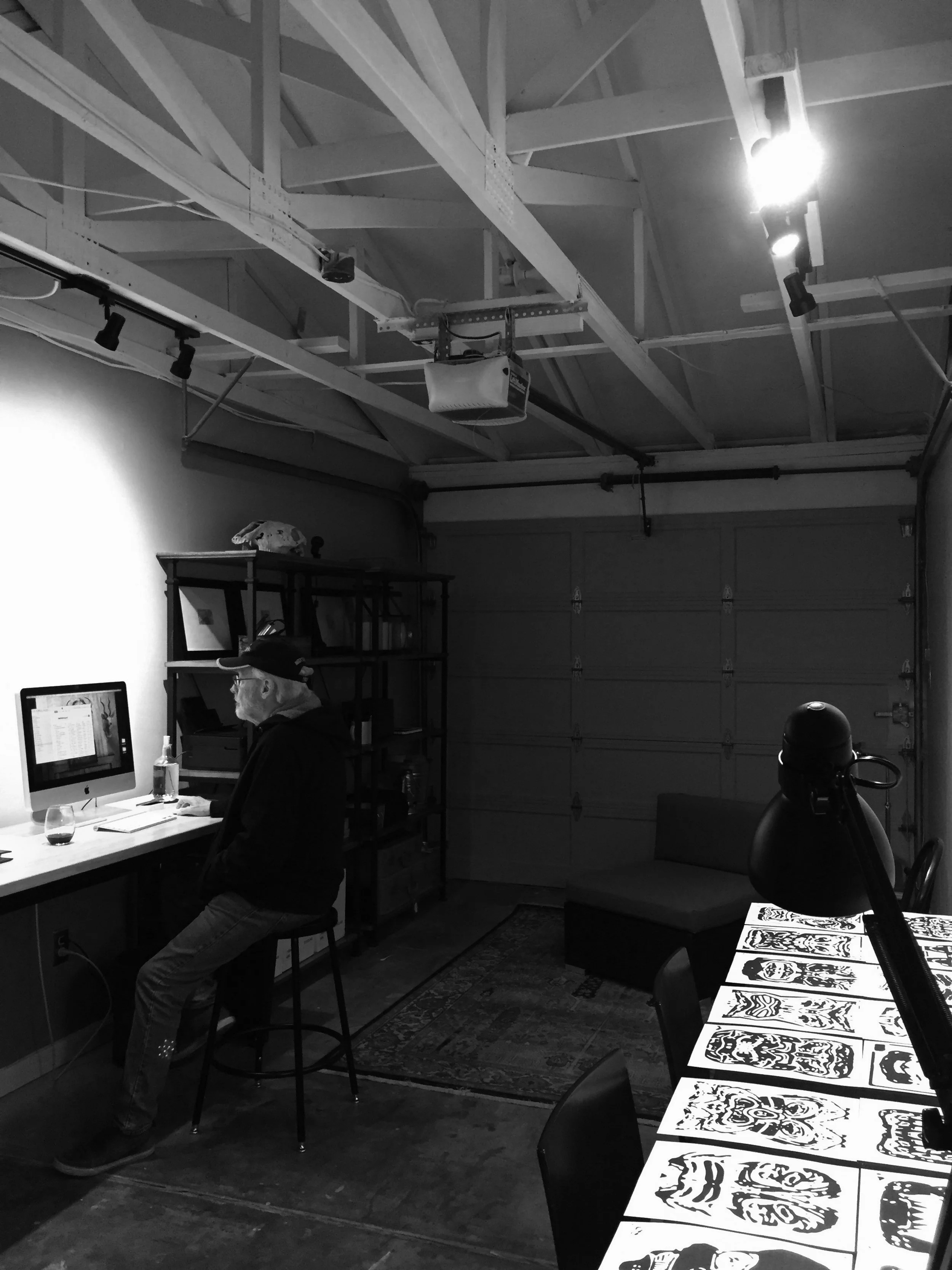
There is a practical lesson here for anyone building a specialist service business. Tools can widen the geography of a practice without broadening the sources of demand. A designer able to deliver work from anywhere still needs someone with a reason to commission it. Seabaugh’s second occupation makes that distinction unusually visible. Independence included organizing his hours around another employer’s timetable.
Laura Lamar, in the publication credits
MAX’s own description puts print publication design first: magazines, books, brochures and annual reports. It also lists illustrated maps, custom logos, illustration, photography, typography and small-business marketing. The grouping is revealing. These are services that join words and pictures into something a reader can use. The likely alternatives are an independent editorial designer, an illustration specialist or a publisher’s own design department, depending on the assignment.
Lamar brings a distinct editorial strand to that mix. In a 1994 Princeton Day School alumni update, she described running the San Francisco graphic design company and working on interior-design books for Chronicle. Years later, Spectrum identified her as its art director and Seabaugh’s partner in MAX. By 2018, the magazine referred to her as a former art director while presenting her word-collage work.
In that 2018 presentation, Spectrum explains that Lamar’s word collages were generated with Wordle from supplied keywords. It is another small example of a tool entering the work through an editorial purpose. A selection of words becomes visual material, asking readers to look at language as well as read it. Set beside Seabaugh’s move into computer illustration, the example gives the partners’ interest in typography a particularly literal form.
The commissions also reach beyond books and magazines. The winter 2007 edition of Judgment Collection News credits Laura Lamar/MAX Design Studio with design and production. That is an audience a tourism brochure will never meet: readers of a professional association’s newsletter. The connection is editorial organization. A publication needs a hierarchy that can carry its particular material, whether that material concerns a destination or a specialist trade.
Read together, those credits suggest a commissioned-service business: clients bring material and a publishing purpose; the studio contributes design and production expertise. For someone evaluating this kind of practice, completed publications are particularly useful evidence. Look at several pages together. A memorable cover and a readable interior answer different questions about what a designer can deliver.
“specialists in print publication design”
MAX Design Studio · LinkedIn description
Seven routes that fit in your hand
In May 2010, Lake County announced seven Clear Lake Water Trails brochures, crediting Lamar with graphic design. The project brought together county departments, community contributors and National Park Service technical assistance. Its intended readers were residents and visitors exploring by kayak, canoe or other nonmotorized craft. The launch announcement describes a collaborative process involving research, GPS mapping and draft circulation to interested groups.
That division of work matters. Design turned the material into a publication; community and technical contributors supplied the knowledge behind it. Readers commissioning something similar can copy that arrangement: decide who owns the facts, who reviews them and who organizes their presentation. Asking one person to make a page attractive cannot settle disagreements about the information that belongs on it.
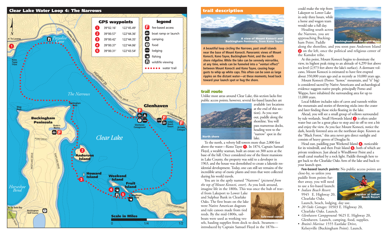
Unfold The Narrows guide and the design problem becomes visible. A central map shares space with route descriptions, photographs, a legend and numbered GPS waypoints. Different forms of explanation work together. The map establishes relationships; the prose adds sequence and context; the photographs give recognizable views. The reader can enter the spread through whichever element answers the immediate question.
Its cover also puts trip distance, approximate duration and experience level together. Those details change how a scenic image should be read. The mountains may catch the eye first, but the practical information helps define the outing being presented. In a visitor publication, the hierarchy needs to leave room for both attraction and qualification.
Three ways into the same place. Editorial analysis of the published layout.
The Cache Creek brochure uses the same family of elements for another route. The Soda Bay edition includes volcanic background, while the Rodman Slough guide features wildlife and local landmarks. A repeated structure makes a series recognizable while leaving each place its own material. For a client with several related publications, that is a useful brief: specify what stays consistent and what deserves to vary.
There are limits to what this approach can accomplish. A printed guide depends on the accuracy and currency of its underlying information. A layout cannot keep an access point open or update conditions by itself. These 2010 publications are instructive design artifacts; a present-day visitor needs current local information when planning a trip. For publishers, maintenance belongs in the brief alongside the first edition.
A county assembled by many hands
MAX’s Lake County work also includes a design-and-production credit on the Heritage Tour, dated February 2005. The project combines local historical narratives with audio. Its credits name separate contributors for writing, performance direction and recording, and identify United States Forest Service funding. The studio’s role sits inside a wider production, helping present a place whose story comes from several people and institutions.
The 2015 Official Lake County Visitor Guide offers another revealing set of credits. It lists Lamar/MAX for design and production alongside Myra House of SOUL Cooperative. Both Lamar and Seabaugh appear among the principal photographers; Lon Sharp receives the maps credit. Lake County Publishing produced the guide in partnership with the Lake County Chamber of Commerce.
Those distinctions are worth preserving when judging a portfolio. A finished visitor guide can contain several people’s design work, another person’s cartography and photographs from many contributors. The credits show how MAX participated. They also show the kind of coordination a publication requires before the reader sees a single page: separate crafts, with a shared destination.
Dinner becomes a publication
The partners’ own book, Chez Max (Max’s House), brings that mixture into the kitchen. Published in November 2012, the square softcover contains 120 pages, more than 225 recipes and 125 original photographs and illustrations. Its description promises a personal account of living and cooking in Northern California and uses the phrase “Haute Hillbilly.” The book includes local history, a contents page and an index alongside the food.
120 pages. A 7 × 7-inch book.
A household’s material, given editorial order.
The listed softcover price was $50.05 when checked in September 2026. That figure buys the book; it is separate from commissioning studio work. As a product, the volume lets a reader see the partners acting as authors and image-makers around a subject they share. As an example for other creative businesses, it suggests a useful exercise: make a finished publication from material close enough to know well.
Lamar’s Spectrum essay about food and memory gives the cookbook a more personal setting. She describes cooking with Seabaugh and the role meals play in remembering a loss. The work and the household overlap without becoming interchangeable. A recipe collection carries technical instructions, but it can also preserve the reasons somebody wanted to cook a particular dish.
The cars acquire faces
Seabaugh’s later photographic work adds another turn. His Cargoyles images rearrange vehicle photographs into strange symmetrical forms: masks, creatures and imagined metal constructions. A 2024 FOTOSEPTIEMBRE monograph presents the project, and the festival catalog credits Michael Mehl as curator, with assistance from Ray Seabaugh and Laura Lamar. The connection to the studio is the founder’s continuing image-making practice.
For a reader encountering MAX through its maps, those creatures are a pleasant change of company. The practical publications help identify a real place; the artwork invites the eye to invent something from familiar parts. Both reward attention to arrangement. MAX’s history becomes most interesting at that scale: a working day divided around a bus route, a lake organized across a folded sheet, a household gathered into a book.