A logo can carry a company’s name. Asking it to carry a laboratory, an insurance business or a community’s ambitions is a trickier assignment. CMg Design’s portfolio lives in that crowded space between what an organization knows about itself and what somebody else has time to understand. Its work includes a NASA laboratory website, an insurer’s refreshed identity and a nonprofit mark made out of words. Plenty of words.
The Pasadena graphic design studio, founded by Julie Markfield and Greg Crawford in 1992, described its practice through branding, marketing communications, websites and environmental design. Read together, its projects suggest a more useful description: making complicated organizations legible. A scientist needs the right technical detail to survive the layout. An insurance customer needs to recognize a familiar business on a new screen. A community group wants its purpose to show up before anyone reads the brochure.
That is a demanding corner of commercial design. The audience may be impatient, but the subject cannot simply be thinned out until it looks fashionable. CMg’s documented work offers a small, revealing tour of the decisions involved: what to keep, what to reorganize and how to give the reader somewhere to begin.
The laboratory website began on paper
At NASA’s Jet Propulsion Laboratory, CMg’s connection to publication design is visible in the credits. The 2015-2016 Technology Highlights names Greg Crawford and Elena Solis under CMg Design Inc. The publication draws together research ranging from novel fabrics to robotic exploration. The design assignment sits alongside scientific contributors, editors and writers, part of the machinery that turns specialist work into a document somebody can navigate.
An earlier Microdevices Laboratory website provides the clearest example of that thinking moving between formats. Developer Scott Orchard’s project account credits CMg with the design and describes the laboratory’s annual reports as the starting point. A corresponding portfolio entry was published in August 2010. The site drew on the wider visual language of NASA projects while giving this particular laboratory its own identity.
The useful idea is modest: inspect the communication an organization already does well before commissioning an entirely new appearance. A report may contain an effective hierarchy, a recognizable image treatment or a sensible way of grouping information. Those decisions can inform a website. The pages still need to behave like web pages; preserving a visual vocabulary does not require preserving the dimensions of a book.
Publication work also gave CMg a recruitment assignment. JPL’s June 2012 newsletter reported four Communicator Awards for the studio’s Discover JPL brochure, which highlighted student research, academic collaboration and recruiting. Here the intended reader was someone considering a relationship with the laboratory. The design had to make opportunities visible, as well as make research interesting.
One recruiting brochure. Four awards.
Discover JPL made student research and academic opportunities the subject.
Mercury needed recognition on a smaller screen
Mercury Insurance’s January 2015 announcement of its first national advertising campaign explicitly credited CMg with a refreshed logo. Advertising director Erik Thompson described the mark as more suited to digital platforms while maintaining a connection to the insurer’s history. The brief was practical: help people identify Mercury as it reached a broader audience.
The credits also establish the boundaries of CMg’s role. Kovel/Fuller created the advertising campaign; Palisades Media Group handled media strategy and planning. CMg supplied the identity refresh. That distinction matters when evaluating a design firm: a logo appearing in a national campaign demonstrates a particular contribution, rather than authorship of every commercial and media decision.
Its digital work for the insurer extended beyond the mark. Orchard’s Mercury Insurance Agents Portal portfolio, published in June 2014, credits CMg with design. The project organized regional product and service information to support agent recruitment. The intended audience was an intermediary who needed useful details about doing business in a particular state.
Taken together, these assignments show two different jobs for the same client. One concerns recognition; the other concerns finding relevant information. A company buying design should be able to name which problem it needs solved. A memorable symbol cannot supply missing product details, and a detailed portal cannot compensate for an identity that becomes difficult to recognize in use.
Recognize
Mercury identity refresh
Digital media fit
Navigate
Agents portal
Regional information
A nonprofit put its vocabulary in the logo
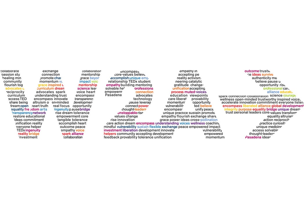
For Words2Action, the nonprofit parent of TEDxPasadena, CMg took a deliberately literal route. In an August 2018 account, Markfield explained that more than two dozen words formed the logo itself. An arrow expressed movement from discussion toward action. Black lettering, selected colors and the sans serif typeface Lulo Clean One gave the composition its visual structure.
The organization’s work included opportunities for teenage girls, with event scholarships, mentoring and educational programs. CMg’s response treated language as drawing material. The result asks viewers to notice the large shape first, then discover smaller words inside it. It rewards a second look in a way a plain set of initials would not.
There is a useful constraint hidden in that device. A word-built identity depends on a setting where its smaller components can be seen. A buyer considering a similarly intricate mark should test it at the sizes people will actually encounter. The appeal of the construction and its performance in a tiny space are separate questions. Both belong in the brief.
Eleven brochures are a relationship
A recommendation on Markfield’s professional profile supplies an unusually concrete description of repeat work. Parsons executive Erin Kuhlman said CMg had designed 11 brochures for the company since 2000 and led its 2016 brand refresh. Her emphasis was on the studio’s understanding of the business and the collaborative way the teams worked together.
The number is interesting because it points toward continuity. A series of brochures lets a studio build familiarity with an organization’s terminology, audience and approval habits. A later identity project can draw on that accumulated knowledge. This is the appeal of an ongoing agency relationship: each assignment need not begin with a complete explanation of what the client does.
CMg’s broader client history crosses several kinds of institution. Former art director Stephanie Tokar’s professional résumé lists Dole Foods, NASA/JPL, Mercury Insurance, Ross Stores and Southern California Edison during her 2008-2014 tenure. It describes responsibility for publications, websites, environmental graphics and marketing material. This was a practice serving businesses with varied communication needs, rather than a studio tied to one product category.
The resulting business model is best understood as commissioned creative services. Clients buy expertise and finished work around a brief. In this market, alternatives include an internal design team, independent specialists and larger agencies. CMg’s portfolio makes its case through continuity across assignments and media, plus familiarity with institutional subject matter. Those are useful buying criteria for organizations whose communications must remain coherent over several years.
“Since 2000, CMg has designed a total of 11 brochures for Parsons”Erin Kuhlman / client recommendation
The people behind the patient work
CMg’s founders presented a practice in which the principals stayed involved in projects of different sizes. The service range also included writing, editing, photography and social media support. That combination recognizes a familiar production problem: an attractive layout still depends on the quality of the words and images available to fill it.
Markfield’s recommendation of Elena Solis gives a more specific view of the working culture. She singled out the designer’s ability to handle complicated JPL and Annenberg Space for Photography assignments independently, combining visual judgment with writing, communication and project management. Her short assessment, “Plain and simple, Elena cares,” is less illuminating than the responsibilities around it. The praise describes someone trusted to carry a complicated job through.
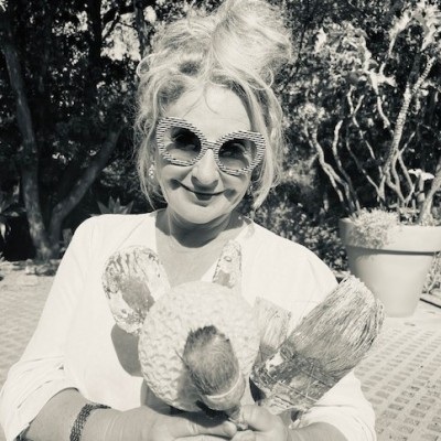
Markfield located some of her own preparation in an unexpected place. Writing in 2018, she traced her confidence and willingness to try difficult things to ten childhood summers at Camp Timberlane. Group activities, repeated attempts and learning to get along with other people became her informal education in running a business. The recollection gives a human explanation for the studio’s emphasis on collaboration.
By June 2022, she was describing another application of those visual skills: large abstract collage paintings made in a converted garage studio. She connected her understanding of composition to decades in graphic design. A February 2023 Art Dimensions podcast explored that painting practice and its relationship to her earlier work. It is a founder’s creative development, with its own scale and audience.
What belongs in the brief - and the budget
For a reader commissioning comparable work, CMg’s projects suggest a useful starting document. Name the audience, the task and the format before choosing a visual treatment. For a laboratory, that might mean helping a prospective collaborator locate a capability. For an insurer, it might mean keeping a mark recognizable across digital placements. For a nonprofit, it could mean giving a mission a visible form.
Then separate design decisions from production decisions. A commission can involve research, writing, identity development, layout, coding, printing or fabrication. Each belongs in the scope and each needs an owner. Ask for a proposal that makes those responsibilities explicit, including review rounds, handoff files and future updates. That is a practical budgeting approach drawn from the variety of work here, rather than a price claim about CMg.
The same approach has limits. A company still arguing about its purpose may need to settle that argument before approving an identity. A technically dense website needs accurate material from subject specialists. An elaborate typographic mark needs testing in its smallest applications. These are conditions a buyer can assess before the first presentation, when revisions are still decisions on a page rather than changes to a finished installation.
CMg’s portfolio is most persuasive at this everyday level. A report becomes a starting point for a website. A familiar insurer adapts its symbol to different media. A nonprofit makes its own language visible. The reader does not need to know the name of the design studio to benefit. The work succeeds when the organization becomes easier to recognize, easier to understand and easier to approach.
Follow the work
Explore the studio’s profiles, project accounts and a conversation with its co-founder.