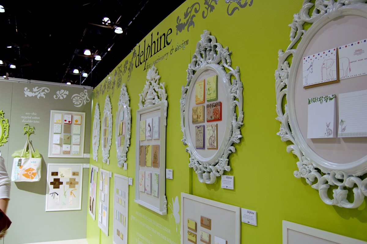
At the 2008 National Stationery Show, Delphine hung small paper goods inside large, ornate white frames. The wall behind them was an emphatic yellow-green. An orange poppy appeared on a tote bag. In a room devoted to things that fit inside envelopes, the display had the confidence of a drawing room.
Designer Nicole Block noticed the booth, praised its presentation and wrote about meeting founder Erika Firm and operations director John Arquette. The photograph makes the appeal easy to understand. There is room to look. Each frame gives its modest contents a little ceremony. You can imagine choosing a card there, then choosing somebody to send it to.
That is a useful place to begin with Delphine: the act of making a small thing feel considered. Its business was invitations and stationery. Its material was paper. Its subject, again and again, was the way people announce that something matters.
The party begins at the mailbox
Firm founded Delphine in 2003, according to her Postable biography. The studio worked in the San Diego area before moving to Charleston. Its range included wedding invitations, save-the-dates, mitzvah invitations and other stationery, combining letterpress with digital printing. Its customers had dates to announce, guests to gather and occasions to distinguish from the rest of the calendar.
An invitation does a peculiar kind of work. It must deliver exact information, but people also ask it to establish a mood. A name needs to be legible; a location needs to be unambiguous. Around those requirements sits the pleasurable problem of whether the event feels formal, relaxed, floral, spare or slightly mischievous.
Delphine occupied that space between information and atmosphere. For a couple planning a wedding, a designed suite offered a consistent visual direction. For somebody sending a holiday note, the commitment could be much smaller: choose a card, find a pen, say something personal. Both purchases made room for taste inside an ordinary piece of communication.
The cactus gets a vote
A 2011 Stationery Trends interview provides an unusually useful glimpse of the catalog. Firm named Rixi as the bestseller, Darlington as her personal favorite, Arizona Cactus as a surprise hit and Amelie as the signature pattern. Four labels, four different kinds of success.
Rixi’s simplicity suited both casual and formal occasions. Darlington mixed modern and vintage references with a little eccentricity. The cactus, meanwhile, had found more admirers than its designer expected. This is the agreeable inconvenience of selling things: customers get to develop opinions of their own.
The distinction is worth borrowing. A catalog can contain a dependable choice, an expression of the designer’s own taste and an unexpected audience favorite without forcing all three to be the same item. That is an editorial reading of Delphine’s collection, rather than a claim about its sales figures. It is also a helpful antidote to treating every product as a flagship.
Six notes. Fifteen dollars.
In December 2011, Washingtonian selected Delphine’s lovebirds holiday notes for its seasonal roundup. The price was $15 for six. The magazine suggested them for people who had recently married or become engaged.
At $2.50 a note, the set gives the story a welcome sense of proportion. Here was a way to buy into the studio’s look without commissioning the paper goods for an entire wedding. The price belongs to that product and that moment; a wedding suite is a different purchase.
It also clarifies the problem a stationer solves. A buyer could write on almost anything. Choosing a designed card is choosing how the message arrives. Whether that is worth paying for depends on the sender, the recipient and the occasion. Delphine’s appeal rested on customers caring about those distinctions.
An invitation hidden inside the press kit
At the following year’s show after the green booth, Delphine tried another small piece of choreography. Its 2009 press-room packets contained two postcards: one about an off-site meetup, another inviting journalists to the booth for a press kit and paper treats. EXHIBITOR later featured the tactic.
The clever part was the connection between the message and the merchandise. A company that sold invitations used an invitation to bring people closer to its work. Editors could pick up the packet quickly, then decide whether to visit. The paper samples gave the visit a purpose beyond another conversation in a crowded aisle.
A business with a physical product can borrow that sequence: make the first encounter clear, offer a concrete reason to continue, and ensure the next encounter delivers something useful. It depends on having something worth examining. If the sample adds nothing, or collecting it becomes a chore, the invitation has created an obstacle. This is a reading of the tactic, not a measured account of its return.
A Charleston collection meets a national stationer
By spring 2014, Delphine had a different route to customers. Charleston Weddings reported its partnership with American Greetings and Cardstore, offering wedding designs in letterpress and flat print. Customers could still work directly with the Charleston studio by appointment.
“They put complete faith and trust in us.”
Erika Firm on American Greetings · 2014
The local references survived the larger storefront. Meeting Street drew on the ironwork of The Mills House; Sullivan’s Island drew on flowers growing on the dunes. The offering also extended into programs, favors and smaller party accessories.
For a host, coordinated items reduce the number of visual decisions that have to be made separately. For a designer, a collection allows an idea to recur without requiring every object to be identical. The interesting part of this partnership is that a recognizable local sensibility could travel through a national retail channel.
The studio closed. The drawing continued.
Delphine’s story has an ending as a company. The September 2021 description of Erika Firm’s Paper Fold interview refers to its doors having closed. The profile is therefore a look at a historical stationery business, alongside the work its founder went on to do.

Firm’s own website now describes an artist and surface designer based on Johns Island. Her licensing practice includes stationery, gifts and home products, with partners such as Minted, Postable and Zazzle. Readers who want to explore her work today can follow those collections under her name.
Looking back at the green booth, the continuity is visible. Paper had been framed, arranged and given an audience. The transferable lesson is modest enough to use: show people what deserves their attention, and give them a reason to take a closer look. An envelope is a small stage. Delphine knew how to set it.
Keep the paper trail going
Explore the founder’s current work and conversations about design.