A promotion sent Jensen Harris to Barnes & Noble. He could write code, specify features, and design software. Now he was supposed to manage six other adults, most with more years behind them. His preparation included a paperback guide to management, a much heavier business book, a short company document, and half an hour with his boss. The paperback had the advantage of being readable. Neither book could do Monday morning for him.
He would revisit that episode when he became Textio’s CEO in 2024. It explained something about the company’s expanding interest in managers: a person could be good enough at one job to be handed another, then discover that the new job came with precious little instruction. A promotion was also a change of discipline. The congratulations arrived before the equipment.
That concern makes a useful way into Harris’s career. He has worked on email, word processors, touch interfaces, writing assistance, and interview software. These seem like different businesses until you notice the person sitting in front of each screen, trying to do something sensible and wondering why the machine makes it so difficult. Harris has spent years examining that small, expensive gap between having a capability and being able to use it.
The composer takes a different stage
Before the spreadsheets and software teams, there was music. Harris studied at Interlochen Arts Academy and Yale, training in composition. At college he also wrote and sold shareware. He was weighing two possible arrangements of the same interests: music as the profession with computers on the side, or software as the profession with music still in his life.
The prospect of writing jingles for household products had limited appeal. Software offered an audience for things he could make, and a Microsoft internship took him to Seattle. He eventually spent 16 years at the company. It was quite a change of venue for a composer, although coordinating a large software team would give him plenty of opportunities to think about orchestration.
The relationship between those interests survives in the way he talks about work. Different specialists contribute different parts; someone has to make the result hold together. A feature can be individually impressive and still sit awkwardly inside the product. Musical training supplied him with a way to describe the practical problem of engineers and designers making one experience together.

An inbox with room to read
His first job after college was on Outlook. Email was becoming a central part of everyday work, and the program brought him into contact with calendars, scheduling, contacts, synchronization, and the many other chores that messages drag behind them. By 2001, he had been offered leadership of its user experience team.
Consider the arrangement of an inbox. A message list, a preview, and navigation all compete for space. His team’s vertical three-pane layout made more room for reading. Labels such as “Today” and “Yesterday” made time easier to scan. These are quiet decisions. They become noticeable when an interface gets them wrong and makes a reader perform arithmetic before opening an email.
Harris remembers presenting the changes to a skeptical Bill Gates while wondering whether someone his age should have been given this responsibility. The presentation had stakes, but so did the everyday details: where attention should land, what belongs together, which information helps a reader understand a message. Outlook put those decisions in front of people repeatedly. An email interface gets plenty of chances to annoy its audience.
The features were there. The people were lost.
In 2003, Harris moved to the Office redesign. The suite had accumulated commands, toolbars, and panes over successive releases. More functionality meant more places to search. Users could suspect that the answer existed somewhere inside the software and still have no reasonable idea where to look.
Usage data supplied an uncomfortable number: 90 percent of users used less than 10 percent of the features. That did not mean everyone wanted exactly the same small set of commands. It did mean that the product’s abundance was failing to translate into an equally abundant experience. Office had plenty to offer, but the invitation was becoming difficult to read.
The redesign introduced the Ribbon, contextual tabs, galleries, and Live Preview. A gallery could show a result before the user committed to it. Preview reduced the familiar formatting routine of choosing something, disliking it, and reaching for Undo. The interface was being asked to carry more of the explanation, leaving the user with less detective work.
A redesign also disturbs habits. People who know where everything lives have invested time in that knowledge; moving the furniture can make them feel like visitors in their own house. The difficulty for Harris’s team was to improve access without treating familiarity as a trivial concern. Office 2007 put that argument on millions of desks.
of users used less than 10% of the features.
A tomato-colored argument
The Ribbon’s early drawings had a red hue inspired by an idea that each application might have its own color. The PowerPoint experiment acquired the name “Tomatoeey.” Software history sometimes turns on a grand strategic vision; sometimes it leaves behind a tomato-colored prototype.
Harris pushed for a horizontal Ribbon even though a vertical list would have been easier to extend. Width creates a problem that height can postpone with a scrollbar. The team therefore had to work out how command groups would behave as windows became smaller, including different sizes and collapsed versions. A constraint became part of the design process.
The result travelled. Ribbon interfaces appeared in AutoCAD, MATLAB, and Sibelius, the notation software Harris himself used. That last connection has a satisfying circularity: a musician goes into software, then encounters his software work while making music. He also acknowledges that the Ribbon answered particular Office problems in a particular period. A design can have a long afterlife without becoming a universal prescription.

Then the screen had to answer a finger
In early 2009, he took on the team developing the touch experience that would appear on Surface and in Windows. The problem had changed again. A mouse pointer can hit a small target; a finger has a less delicate relationship with a crowded screen. Device size, grip, movement, and responsiveness became immediate design questions.
The team tested how people held tablets and which areas they could comfortably reach. Heat maps made the ergonomic differences visible. Live tiles could show information before an app was opened; edge gestures gave access to common functions; a split keyboard addressed typing while holding the device. The aim was an experience described internally as “fast and fluid.”
Windows 8 also brought a difficult encounter between a touch-oriented experience and established desktop expectations. When Harris left Microsoft in 2014, Windows 10 had just been shown with a returning Start menu. He said the departure was about wanting to work closer to a product and build something with rapid growth. His team had already worked on the direction being shown. The startup offered a different scale of responsibility and a shorter distance from an idea to its code.
The words finally get a job
Textio began with a conversation between Harris and Kieran Snyder in the summer of 2014. Snyder brought expertise in computational linguistics; Harris brought years inside productivity software. Their question concerned something familiar writing tools had largely left to the writer: choosing words that would produce the intended response.
Formatting could make a document look better. Collaboration could let more people edit it. They wanted software that connected language with outcomes. For a job description, that meant asking how the wording might affect who applied. The screen could become a place to test a choice before sending it into the world.
Harris designed the early experience and wrote the frontend code himself. After leading larger teams at Microsoft, this gave him direct control over details he cared about. Textio reduced complicated analysis to guidance a writer could use, including a score from zero to 100. The design problem was familiar even though the technology had changed: how much explanation does a person need, and how should it appear at the moment it can help?
A manager needs more than a blank box
Harris succeeded Snyder as CEO in January 2024, having also served as CTO and chief experience officer. Snyder retained her board seat and became chief scientist emeritus. Their partnership had carried the company from its founding into a new period of products and expectations around AI.
His April relaunch message returned to the inexperienced manager with the paperback. He argued that managers needed help setting clear accountabilities and giving useful feedback. A blank performance-review box could collect writing, but it did little to help someone decide what to say. Textio’s feedback tools brought guidance into that task.
The next hiring problem was further along the process. A well-written job post could attract candidates, but an improvised interview could still make comparison difficult. Questions varied. Notes were incomplete. The debrief rewarded a confident recollection, which is hardly the same thing as a careful evaluation. Harris’s work on Lavalier took that stretch of hiring as its subject.
“I could not have been less well-prepared.”Jensen Harris, recalling his first management role
Put the evidence on the table
Lavalier organizes the work around defining a role, planning interviews, guiding conversations, and comparing candidates against shared competencies. The underlying concern is remarkably mundane: the recruiter and manager should agree on the job before asking strangers to prove they can do it. Ambiguity at the beginning has a habit of multiplying.
Harris conceived and shaped the product with the team. Its tools help assign questions, capture notes, and bring interview evidence into comparison. The hiring decision stays with people. That boundary matters to his description of the work: software should improve the material available for judgment and the structure around it.
His CEO tenure ended in 2026. Textio now lists Colleen Gallagher as CEO and Harris as founder emeritus; his own biography describes continuing involvement as a co-founder, board member, and CTO emeritus. The titles have changed again, but the questions in his product work remain recognizable.
- 01Agree on the role
- 02Plan the questions
- 03Guide the interview
- 04Compare the evidence
The hiring decision remains with people.
A treehouse, with interruptions
His current company, Expedition 60, works with organizations reconsidering how their product and engineering teams build with AI. The brief extends beyond tools to process, roles, structure, culture, and people. He also coaches technical leaders and founders. After years managing the relationships between disciplines, he is taking that experience into other companies.
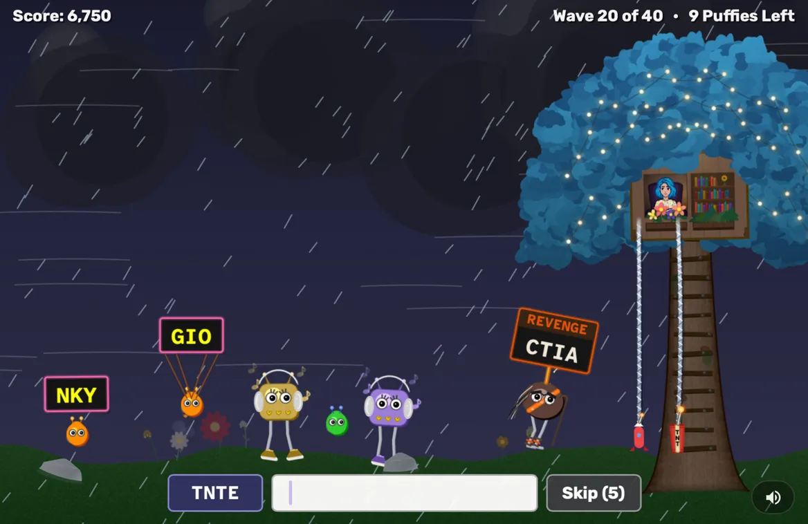
There is a smaller project, too. Harris built Sky Nook as a gift for Snyder. A reader named Sky wants peace in her treehouse, while a trio of chatty creatures keeps approaching. Players make words from letters in a given order to send the visitors away. The game includes art, music, daily challenges, and leaderboards. Even a quiet afternoon apparently requires a backend.
It is an affectionate ending to a career story still in progress. Office made commands easier to discover. Textio made the consequences of words easier to consider. Lavalier gathers material for a hiring decision. Sky Nook gives a reader a little room to herself. Across those changes of scale, Harris keeps building around the moment when someone wants to get on with what they came to do.