The interesting detail is in the parentheses. In the 2025 Print Excellence Awards, Creative Press appears beside an art-book category restricted to one, two, or three colors. A small palette, in other words. The Anaheim printer also received the competition’s Best of Show. Anyone tempted to equate a better printed object with a longer specification should linger over that combination for a moment.
It suggests a useful way to think about the business. A designer can ask for more: more color, more finish, more elaborate production. The harder request is to make a particular image work. That requires choices. Which tone matters? Where should the eye settle? What must remain visible in the shadow? A printing company earns its place in that conversation when it can turn those choices into something another person can hold.
A company you can understand on paper
Creative Press is a commercial printer. Its public business listings cover offset printing, typesetting, and bookbinding. Its documented output includes art books and an exhibition poster. Those are physical deliverables, involving the passage from prepared artwork to a manufactured object. The work suggests a market of buyers responsible for that passage: designers, publishers, and organizations commissioning printed work.
The practical problem is deceptively ordinary. An approved file is still a file. Someone has to reproduce it on a chosen material and deliver an object whose pages, surfaces, and finishing agree with the original intention. A buyer who cares about a photograph’s subtle gradations has a different brief from someone ordering a disposable information sheet. Both are buying print, but they are asking the printer to protect different things.
Creative Press belongs in the conversation about reproduction and production craft. Its comparison set includes regional companies such as Advantage ColorGraphics, Clear Image Printing, Colornet Press, and Lithographix. They appear alongside it in the 2025 awards. For a buyer, that is an invitation to compare actual work. An award can earn a printer a place on the shortlist; the relevant sample still has to earn the job.
The national recognition came separately. Creative Press won Best Unique Ink in the 2025 Americas Print Awards, whose final field comprised 97 regionally recognized entries and produced 21 winners. Those numbers describe the competition, not Creative Press’s output or success rate. The useful signal is the kind of attention involved: people in the trade were examining how a printed piece had been made.
The very small business of a dot
The company’s historical website describes working with Creo to introduce 10-micron Staccato screening into production. It is a wonderfully specific thing for a printer to put in its shop window. Ten microns equals one hundredth of a millimeter. At that scale, the sales pitch has become a question about the structure of an image.
Screening is part of the translation from a continuous-looking picture into printable marks. Kodak describes Staccato as stochastic, or frequency-modulated, screening. In a simplified comparison, conventional screening varies dots on a regular grid; FM screening varies the distribution of fine marks. The arrangement is doing visual work even when the reader never thinks about it. The diagram below is a conceptual enlargement, not a measured sample of Creative Press output.
The pattern changes how marks build a tone. Illustration only; not a quality comparison.
There is a condition attached to the small number. Kodak’s documentation makes Staccato settings dependent on licensing and output resolution. Its color-management guidance also treats the press, ink, substrate, and screening as parts of the printing condition. Buying one component does not settle all the other decisions. This is why a technical discussion can become surprisingly practical: the paper in the buyer’s hand belongs in the same conversation as the image on the screen.
“Technology and equipment can be purchased, integrity and knowledge cannot.”Creative Press · company website
A poster about the history of color
Another piece of the company’s record takes us into a museum. The International Printing Museum’s Winter 2010 newsletter credits Mike Patton of Creative Press with printing the color poster for The Huntington’s exhibition, The Color Explosion. The exhibition account also describes a demonstration of stone lithography, with visitors watching a laborious process produce a print they could take home.
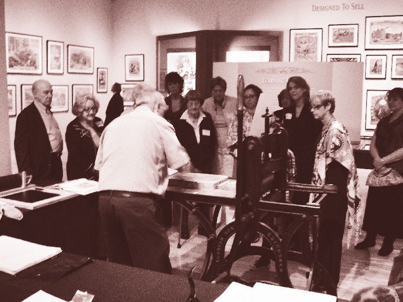
The connection is modest and rather pleasing. A commercial printer helped present an exhibition about the craft’s earlier achievements. It places the business inside a working history of image reproduction, where newer tools coexist with an appreciation for difficult old techniques. There is no need to turn the poster into a grand corporate origin story. It is a concrete job with a memorable subject.
A separate association record lists Creative Press among contributors to a 2008 surplus-material drive supporting graphic-arts education. Michael L. Patton also appears on PIASC’s 2011-2012 board. These are small, verifiable forms of participation in a trade: materials for teaching, a place in its professional organization, an object for an exhibition. They make the company more legible than a generic statement about community.
The quote starts with the difficult page
For someone considering Creative Press, the useful first move is to assemble a precise brief. Include the dimensions, quantity, intended paper, finishing, and deadline. Then choose the page that will make the printer think. Perhaps it contains a delicate tonal transition or an image whose detail carries the whole idea.
Ask what a representative physical sample can demonstrate, and what still needs to be tested for this job. Keep the comparison consistent between suppliers. If one quote uses a different stock or finishing specification, the total is answering a different question. This discipline is easy to copy: decide what success looks like before inviting someone to put a price on it.
- The objectFormat, quantity, paper, finishing.
- The hard partA representative image or page.
- The acceptance decisionSample, approval steps, delivery date.
The economics require that same specificity. Printing involves preparation as well as production; material, setup, press time, and finishing all matter. Heidelberg’s discussion of print economics recommends considering the complete job. Its current guidance also distinguishes the usual strengths of short-run digital work and medium- or long-run offset work. A tiny order, frequently changing content, or individualized pages may call for a different production approach. No universal quantity threshold makes that decision for every job.
Creative Press’s limited-color art-book recognition leaves the reader with a better question than how many options a printer can offer. What will this particular object gain from the decisions being proposed? A good answer should be visible in the sample, understandable in the specification, and accounted for in the quote. The parentheses on that award listing make an unexpectedly useful starting point.