The dragon has a problem. It belongs on the cover of A Fire in the Blood, where its copper-colored scales and curling body announce a world of danger. But there is another creature competing for space: the title. Let the dragon win completely, and the reader may remember the monster without remembering the book.
Chathuranga Dissanayake describes arranging the animal around the lettering. The portfolio mockup shows the bargain: orange against teal, pale type across the center, a castle pushed into the distance. You can enjoy the atmosphere at full size. Shrink the picture, and the larger shapes still have something to say.
This is a useful introduction to Book Cover Design, the business whose LinkedIn page points to Dissanayake’s ProDesignUp studio. Its name could hardly be more literal. Its recurring problem is rather more interesting: how much of a story should survive on the outside of a book?
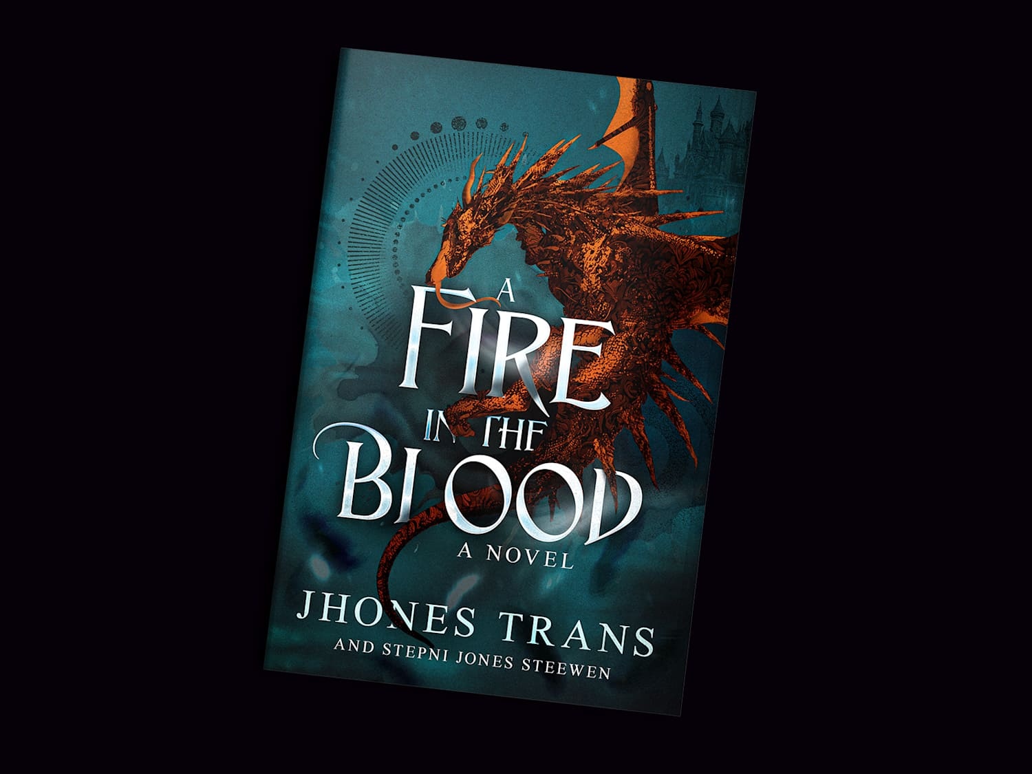
A whole novel. One small rectangle.
In his writing about covers, Dissanayake treats the image as a concentrated marketing task. Genre needs to register; a prospective reader needs a reason to look closer. The premise is familiar to anyone who has browsed a page of books without opening a single one. There is a selection process before the first sentence gets its audition.
An author naturally knows too much. The side character matters. The ruined city matters. That object introduced in chapter four will matter tremendously by chapter nineteen. A cover cannot give every detail equal billing. Looking at this practice’s work, the interesting editorial act is deciding which element gets to represent the rest.
For a typography-led project, Dissanayake described using red, black and white, overlapping letters and two colorways. His explanation was admirably plain: “I made the title the hero.” The picture, in that case, was largely made of words. That is a useful counterpoint to the dragon. A recognizable approach need not mean applying the same visual treatment to every manuscript.
The knife does less explaining
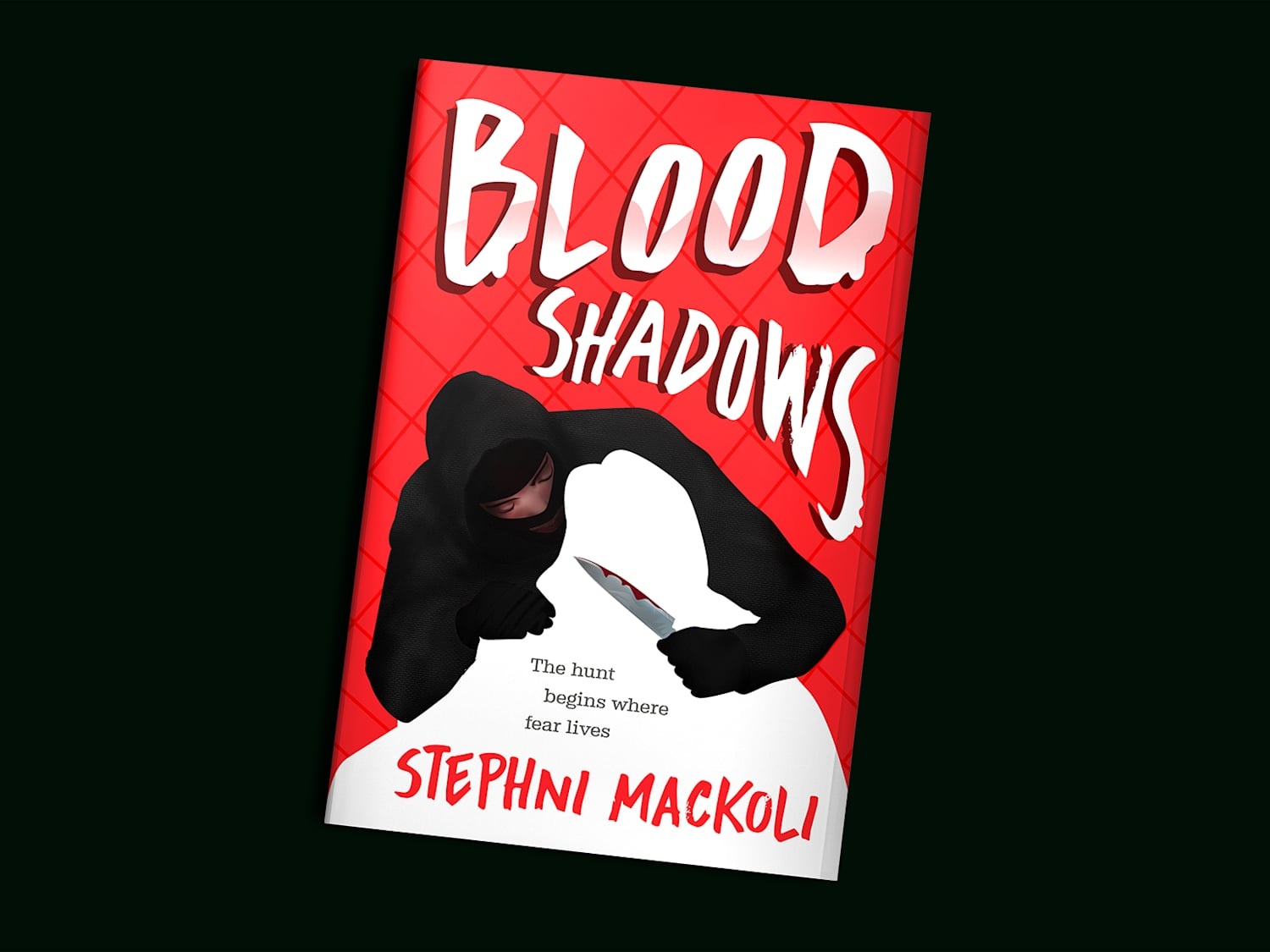
Consider another portfolio cover, Blood Shadows. Its ingredients are blunt: red field, dark hooded figure, white silhouette, knife. The composition makes the threat intelligible without building an elaborate location around it. The empty white shape gives the dark figure something to loom over.
Compare the two mockups and the contrast is instructive. The fantasy image offers a textured world; the horror image offers an encounter. Neither needs to provide a synopsis. As an editorial reading of the work, the transferable principle is to choose a dominant visual event and make the supporting details earn their space.
Dissanayake makes a related argument about movie posters: technical finish alone can leave a viewer unmoved. Compositing, lighting and color work need to generate curiosity. That connection helps explain where this practice fits. It sells visual introductions for authors and other clients who need an audience to notice a story, product or identity.
What the author is buying
The company’s description is written in the first person. Dissanayake presents himself as a freelance graphic designer taking individual projects. That small grammatical detail makes the offer easier to understand: an author is commissioning work and entering a feedback relationship.
The matching Fiverr cover listing currently advertises a $30 ebook front-cover package with a showcase mockup. Its FAQ describes a $100 premium package extending to back and spine, a dust jacket, licensed stock images and editable files. These are advertised offers checked in September 2026; the agreed scope and price at checkout govern an actual order.
There is also an older LinkedIn promotion offering cover work for $10, with rapid delivery and revisions. Read it as a historical offer. Placing the two prices side by side does not reveal profit, production cost or how long a particular cover took. It does reveal why buyers should compare the contents of a package instead of shopping by the number alone.
The listing’s briefing questions are practical: title, author name, format, publishing platform, dimensions, page count and back-cover copy. A useful preparation exercise is to gather those details before discussing atmosphere. Otherwise a conversation about the perfect shade of midnight may run ahead of the much less glamorous question of what files the author actually needs.
Public recommendations add texture to that relationship. Chris Eaton names The Lien Lever and praises Dissanayake’s responsiveness through the design process. Kayden Etter describes requesting changes and returning for more work. The cover gig displays 947 reviews and a 4.9 rating at research time. Those are marketplace signals of experience, rather than a prediction about any particular book’s sales.
The post that applause could not rescue
Dissanayake offers a more revealing business anecdote than a polished testimonial. He says one post with six reactions brought him three clients, while another with 200 reactions brought none. It is a personal account of two posts, with all the limits that implies. Still, it makes an excellent little nuisance of a question: what, exactly, is the business measuring?
In the same account, he says he now challenges briefs that lack direction. That is a specific change in working behavior. The habit readers can borrow is to make disagreement useful early: identify the audience, say what the work must accomplish, and flag incompatible expectations before polishing a concept.
“I don’t let misalignment slide anymore”Chathuranga Dissanayake, on handling unclear briefs
For someone hiring a designer, this suggests a better conversation than asking whether a cover looks impressive. Ask what it communicates, which element leads, and which detail could disappear without damaging the idea. You can conduct a rough version yourself: shrink the image, look away, look back, and see whether you can still read the title and recognize the intended genre. Treat it as a briefing exercise, not a sales forecast.
A wider practice, with a narrow first job
Book covers are the front door to a broader set of services. Dissanayake also presents brand identity, packaging, illustration and cinematic posters. His GEETNESS identity presentation applies a geometric mark and lime-green palette across packaging, apparel, stationery and interface mockups. The work demonstrates an identity traveling between formats; a mockup is a demonstration, not proof of a commercial rollout.
His Twine profile adds a personal connection to publishing: he says he created Cuddle Crew, a children’s coloring book containing 35 animal illustrations, and handled its formatting and cover. The same profile lists AI illustration and animation tools. Authors with particular expectations about imagery should make those part of the brief, alongside the format and visual references.
This practice sits among the options available to an independent author: commission a freelancer, approach a specialist studio, choose an existing cover or assemble one personally. Its visible appeal is the combination of genre artwork, individual project work and explanations of design decisions. For a reader considering it, the portfolio is most useful as the beginning of a conversation about fit.
A dragon would be a strange ambassador for many books. A knife would be worse. These examples work as lessons only when the visual promise suits the manuscript. The worthwhile thing to copy is the discipline of deciding what deserves attention. Before asking whether a cover contains enough, ask whether a stranger can tell what matters.