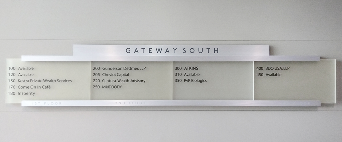
An office directory has a modest ambition: spare somebody the awkward walk back to reception. At Gateway South, one example in Sprint Signs’ portfolio divides a building into neat columns of tenant names and suite numbers. A café shares the board with professional firms. Some spaces simply say “Available.” The sign has to make sense of all of them, without requiring a visitor to admire the design first.
That is a useful introduction to Sprint Signs. The San Diego company works where a business’s graphic identity becomes something people encounter with their bodies: a name on a wall, a marker beside a door, a directory in a lobby. Its offering extends from consultation and design through fabrication and installation. The interesting part is the distance between a customer saying “we need a sign” and an installer having the right object to put in the right place.
Established in 1993 and describing itself as veteran owned and operated, Sprint Signs serves commercial customers, including property management and construction companies. Its public service description includes work for clients in the United States and Mexico. The company’s market is tangible: businesses that need their premises to announce who they are and explain where people should go.
A building speaks in several sizes
The Gateway South directory is restrained. Its pale panels, dark lettering and horizontal rails give the information room to breathe. The building name sits above the tenants; suite numbers lead each entry. You can read the photograph as a small exercise in hierarchy: first establish where you are, then narrow down where you need to be. A lobby contains plenty of visual competition. A directory earns its space by being useful.
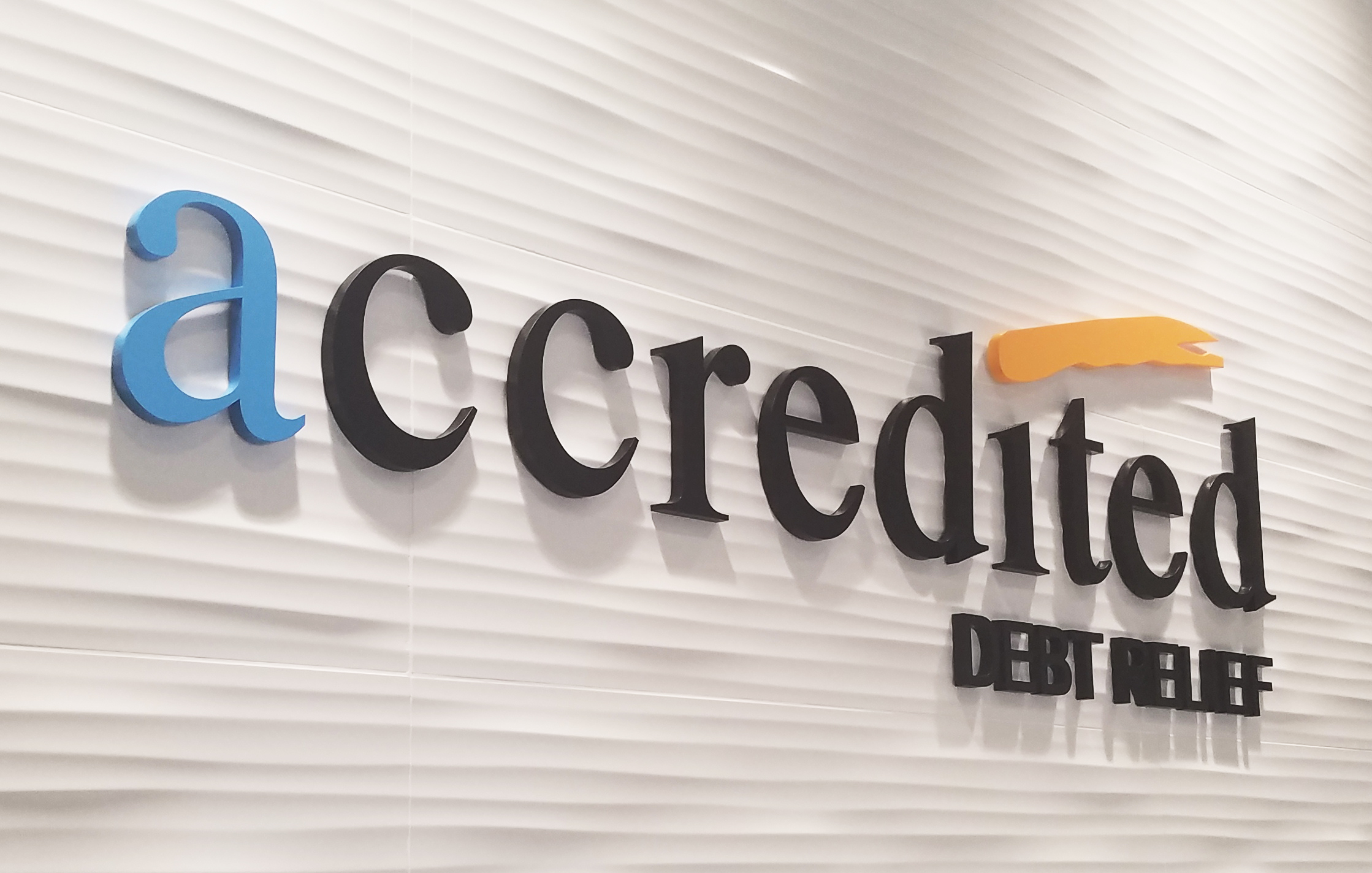
Elsewhere in the portfolio, a reception sign for Accredited Debt Relief makes a different choice. The lettering stands away from a textured white wall. A blue initial and an orange graphic punctuate the darker letters. Shadows become part of the composition. The directory organizes multiple occupants; this sign gives one occupant a presence. Both count as interior signage, but they are answering different questions.
Sprint Signs also lists monument signs, illuminated signs, vehicle graphics and suite identification among its services. Architectural sign packages bring several needs into one assignment. For a property manager, that breadth has a practical attraction: the conversation can include the entrance, the directory and the individual rooms. For a retail business, an exterior sign may be the more immediate problem. A company LinkedIn post, for example, identifies an exterior-signage project for GTM Discount General Stores in San Diego.
The first obstacle can be a perfectly good-looking logo
The company’s artwork page is more revealing than a polished slogan. It distinguishes vector files from raster images and prefers vector artwork for vinyl graphics. That sounds like an exchange between designers until a customer sends the logo downloaded from their own website. An image that looks crisp in a browser may have too little resolution for a much larger physical sign.
Sprint Signs asks for formats including Adobe Illustrator, EPS and PDF, and instructs customers to convert type to outlines. For raster artwork, it specifies 100 pixels per inch or higher at actual sign size. The last four words matter. A file’s suitability depends on the dimensions at which it will be reproduced, rather than how impressive it looks when squeezed onto a laptop screen.
Its guidance also distinguishes between using text and using a finished production file. The shop says it can copy text from Microsoft Office documents, but generally cannot use those documents as signmaking artwork. It offers scanning and recreation of original artwork at additional cost. These instructions expose a familiar gap between possessing a brand asset and possessing the version a fabricator needs.
Sprint Signs’ stated minimum for raster artwork at actual sign size. Vector artwork is its preference for vinyl graphics.
The lesson a buyer can copy is simple: collect the original artwork before requesting production. Ask the designer for the files intended for fabrication, and tell the sign shop how large the finished piece should be. That gives the conversation a concrete starting point. It also gives everyone a chance to identify additional artwork preparation while the project is still a file.
A small approval with a large job
After the artwork comes the proof. Sprint Signs describes this as a graphical representation of the completed sign, including its size and material. Customers can approve by email or return a signed copy. They can also request corrections before production. It is an ordinary administrative step, but one with a clearly stated purpose: checking that the object about to be made matches the object the customer expects.
“Sometimes mistakes are bound to happen.”
Sprint Signs, explaining its proof process
The FAQ’s admission is refreshingly direct. It names size, material and spelling as things the proof is meant to verify. There is a reason those belong together. A sign can contain the right words and still be wrong for the assignment. Equally, handsome materials cannot rescue a misspelled name. The approval creates a moment when customer and maker can examine the same proposal before it becomes physical inventory.
For buyers, the useful habit is to review the proof as a specification, not merely a picture. Read the text carefully. Check the dimensions against the intended location. Confirm the material named in the proposal. If something has changed, this is the place to say so. The company's published process makes revision an explicit step, rather than leaving customers to guess whether asking for an adjustment is acceptable.
Coordinate permitting where required. Project details determine the actual schedule.
The estimate starts with the object
Sprint Signs sells custom work through consultation and estimates. Its FAQ identifies height, depth, lighting, material, design and location as factors in cost and installation timing. That list explains why a reception name and an illuminated exterior installation belong in different pricing conversations. The word “sign” describes the category. It does little to specify the job.
A buyer approaching the company can therefore make the request more useful by describing the intended location and the physical result. Is this an interior identification project or an exterior installation? What artwork already exists? What dimensions are being considered? These are ways to help establish the scope before comparing proposals. The company’s contact form starts that process by asking for company details, signage type and a description of the need.
Artwork preparation can add charges, according to the published file guidance. Permitting adds another set of tasks: Sprint Signs says it can create the necessary graphics and communicate with the city about paperwork and fees before production. That service places the company between the customer’s design intentions and the practical requirements of carrying out the project. It is also a reason to discuss the site early.
A contractor’s work wearing a designer’s clothes
There is independent evidence of Sprint Signs’ place in the construction trade. A San Diego Unified School District roster dated February 15, 2021 lists the company among prequalified Non-MEP subcontractors under license number 1039243. The listing documents eligibility at that time, rather than a school project award. Even with that distinction, it offers a useful view of the business: sign work sits within the procurement machinery of building projects.
The company website displays the same contractor license number. Its service range also includes site surveys. Together, those details help explain its market position. This is a business that has to think about the conditions at a property as well as what appears in the artwork. A prospective customer is buying a fabricated object and arranging for work to happen at a real address.
Commercial sign fabricators, sign franchises and online print suppliers give buyers different ways to obtain signage. Sprint Signs’ stated proposition is the breadth of its custom service, including installation and permitting. The fit depends on how much of that work a customer needs. Someone ordering a straightforward printed item has a different assignment from a property manager coordinating several sign types across a building.
Its offering extends to tactile and braille signage, with a dedicated ADA gallery, and to window film, including honeycomb film and leasing bands. These categories widen the conversation beyond the business name over the entrance. A visitor may encounter several different surfaces and messages before reaching a destination. Sprint Signs has built its service menu around that physical variety.
The work should survive the first visitor
The company says product quality, attention to detail, timely delivery and client relationships underpin its business. Those are familiar promises in a service trade. More instructive are the specific practices visible beneath them: artwork requirements, an approval process, consultation about materials and location, and coordination of permit paperwork. Each gives a customer something concrete to discuss before committing to production.
Return to that Gateway South directory. The tenant names are different lengths. The suite numbers have to remain easy to follow. Vacant spaces need a place in the same arrangement. The finished board makes these competing bits of information look ordinary. That is the appealing part of this business: an object can require several kinds of expertise and still do its best work quietly, when somebody glances at it and walks toward the correct door.
Visit the shop online
Explore Sprint Signs’ website, project gallery and artwork guide, or start a project inquiry. Follow its work on LinkedIn, Instagram, Facebook and X.