The form was online. This was the good news, in the technical sense. The less good news was that it often would not open. A person could arrive ready to apply for veterans' services, click the proper link and meet a software requirement from another age: the correct version of Internet Explorer, paired with the correct version of Adobe Reader. Most government web traffic was already coming through other browsers. The door existed. It simply preferred not to behave like one.
Mary Ann Brody and her colleagues at the U.S. Digital Service learned what that contradiction meant by sitting beside people. In one recorded session, a veteran who knew the site well tried again to reach the application. He had attempted it before. Familiarity was not the problem. Motivation was not the problem. The machinery was the problem, and observation made it impossible to blame the person standing in front of it.
That small scene contains the operating idea of Brody's career. A service is not what an institution announces, funds or launches. It is what happens when somebody tries to use it. The distinction sounds obvious. Institutions have found many ingenious ways to avoid it.
Before the interface, the sentence
Brody came to design through public health. She earned a BA and an MPH at the University of Massachusetts Amherst, and in 2013 became a Certified Health Education Specialist. By the following year, the Society for Public Health Education had named her to its 30 Under 30 group for connecting public health, user experience and technology. The combination matters. Public health supplied the stakes; research supplied a way to see where communication failed.
At CommunicateHealth, Brody worked as a user-experience research manager and became one of the lead editors of the second edition of Health Literacy Online. The federal guide was built from a long research program, including work with hundreds of people and later studies focused on mobile use. Its practical advice can look almost modest: put important information first, write plainly, simplify navigation, test on the devices people actually carry. Modesty is useful camouflage for a radical proposition. The reader should not have to become an expert in the institution before the institution becomes understandable.
Her presentation archive from that period carries the same concern across different rooms: mobile usability for people with limited literacy, research with audiences routinely ignored by product teams, and the limits of web analytics. A dashboard can show where somebody left. It rarely explains the sigh before the exit.
The research also joined language to circumstance. People scan differently on a phone, under time pressure or while confronting unfamiliar terms. A menu that appears tidy in a conference room may become a thicket on a small screen. Brody's contribution was to keep those conditions attached to the design conversation. Accessibility was not a separate ceremony performed at the end. It was a reason to recruit broadly, test early and remain suspicious of elegance that survived only under ideal conditions.
“Benefits and services should do more than exist. They should be accessible, useful, and usable.”Mary Ann Brody and Emily Tavoulareas, 2016
The PDF and the person
At the U.S. Digital Service, Brody took that research discipline into the Department of Veterans Affairs. The setting was larger, the systems older and the consequences of confusion more severe. One project concerned applications for VA health care. Another addressed the benefits-appeals process, where work moved through layers of law, policy, paper and software whose origins stretched back decades.
The team did not begin by asking veterans to admire a prototype. It began by asking them to attempt the task already available. Researchers met people where they were, watched screens, listened to narration and noted the mismatch between an official process and an ordinary computer. Brody and her colleagues also sat with VA employees, studying their workflows from the other side of the counter. This was an important courtesy. Public servants are users of systems too, and a tool that burdens them will eventually return that burden to the public.
The result was not one heroic software release. It was a series of bounded repairs. A new digital application let veterans apply online from current browsers and devices. Caseflow Certification automatically checked whether required documents had been added before an appeal advanced. A later discharge-upgrade tool turned dense manuals and multiple forms into a guided series of questions and tailored instructions. Each tool reduced a particular kind of institutional fog.
The recurring service-design loop
Brody and Emily Tavoulareas described the principle with memorable economy: “Our time with users, and what we learn from them, forms the foundation on which we build.” It is easy to embroider the word empathy on a conference tote bag. It is harder to let another person's experience cancel a cherished assumption, alter a roadmap or expose a policy that software alone cannot fix.
Teaching the open question
The habit followed Brody into the classroom. As a guest in Harvard Kennedy School courses on technology and innovation in government, she introduced students to interviewing, bias and research ethics. Students remembered the force of open-ended questions. They also heard a practical encouragement: some contact with users is better than a team inventing their needs in solitude.
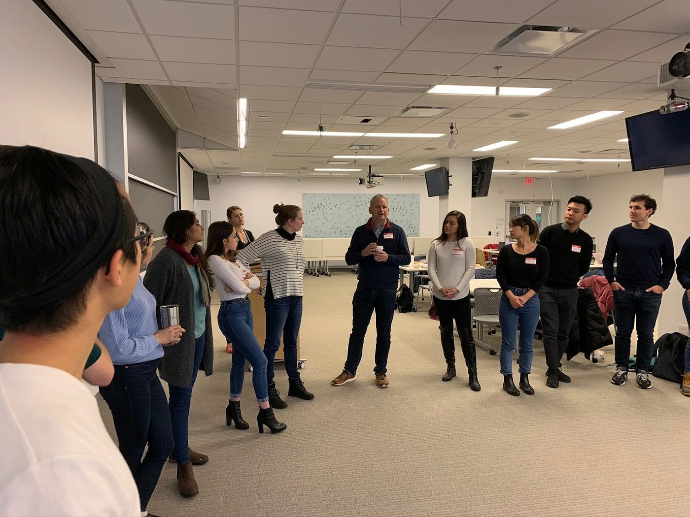
There is a telling physicality to the photograph from one session. The class stands in a loose circle. Brody is not stationed behind a lectern. She is part of the ring, turned toward the speaker. Good research often looks uneventful from across the room. Somebody speaks. Somebody else pays enough attention to be changed by it.
That posture also explains why Brody's field is broader than screens. Human-centered design considers the letter that arrived too late, the handoff between teams, the call whose script leaves no room for the actual question and the policy that makes a sensible interaction impossible. The interface is merely where institutional choices become visible.
A member is not a maze runner
At Devoted Health, Brody's canvas widened again. She first appeared publicly as Head of Member Experience and Engagement and later as Vice President of Experience; current company data identifies her as Chief Experience Officer. The titles changed, but the assignment remained recognizable: shape the end-to-end experience rather than polish one isolated touchpoint.
In this work, a digital product shares the stage with service operations, communications, navigation and the human being who answers the phone. Brody has described teams working across medical, product and service functions so that letters, texts, emails and conversations feel helpful and coordinated. The ambition is not ornamental delight. It is coherence. A member should not have to carry the organization's internal map in order to get an answer.
Her recent work also reaches into nutrition and Food is Medicine programs. In 2025, the Food is Medicine Institute listed her in its Network of Excellence and placed her on a national summit panel about designing programs across patients, providers, pharmacies and payers. It is another system with many handoffs and many opportunities for a person to disappear between categories.
The useful unit of design is not the screen. It is the moment a person asks the system for help.
Brody's public record contains little appetite for the designer as oracle. It shows something more durable: the researcher as witness, the operator as translator and the executive as custodian of the whole journey. Her colleagues' public comments emphasize wisdom, mentorship and an ability to see potential in others. Her own hiring language favors people who simplify complexity and make each touchpoint human and well coordinated. There is affection in the vocabulary, but also a work order.
Clarity, properly understood
Clarity is sometimes treated as the final coat of paint. Replace a long word. Shorten a paragraph. Add a button. Brody's career suggests a more demanding definition. Clear language cannot rescue a broken path. A handsome page cannot make an unavailable service available. A thoughtful call-center worker cannot permanently compensate for an incoherent policy. Clarity has to move upstream, into research, operations and the decisions that determine what the service permits.
This is why the veteran at the stubborn PDF still matters. His screen exposed a problem no mission statement could soften. The observation gave the team a fact, the fact created urgency and the urgency produced a working alternative. No amount of aggregate traffic could have supplied the texture of that moment. A person tried. The system refused. The designers stayed long enough to see which one needed to change.
Brody has carried that lesson from a public-health guide to federal digital services, from a Harvard classroom to a national healthcare organization. The institutions grow larger. The diagrams gain boxes. The essential gesture remains almost comically small: pull up a chair, ask a question and do not interrupt the answer.